Blog Tips: How to Create Pinterest-friendly Images For Your Blog
The following content includes referral links. Read my disclosure policy for more info.
Oh, hey there. Yup, it’s another Pinterest-related post!
A lot of bloggers still wonder how to use Pinterest. I always tell you guys that you should absolutely take advantage of Pinterest because I personally (well.. not, I, personally, but my blog) have gained A LOT of exposure there. I already wrote several posts on how to use Pinterest to grow your blog and you can find them all right here.
A pin is 100 times more likely to be discovered than an average tweet. On average, a pin is pinned about 10 times and will drive two visitors and six pageviews. One of the blog posts I wrote this past summer was pinned over 50,000 times. How much traffic do you think that single pin drove (and still continues to drive!) to my blog? A LOT.
In one of my recent blog posts, I told you guys that updating your images in older blog posts can be a great way to drive some traffic to your archived content. I also highly recommend that you add some Pinterest-friendly images to those older blog posts, as well. Since Pinterest is hugely image-driven, images matter and they matter A LOT.
PINTEREST USERS LOVE IMAGES THAT ARE:
-vertical
-long
-contain text
-contain quality images
The ideal aspect ratio of a pin is 2:3 (600px wide x 900px high). Longer pins work better because they get more exposure. Most Pinterest users use a mobile app and since pins are organized into columns, vertical images naturally take up more space, making them hard to miss/ignore. I noticed a huge difference in my Pinterest referrals when I started including at least one vertical image (usually containing text or some call to action) in my posts.
CREATING POST IMAGES FOR PINTEREST
To give you an example, I’ll show you how I create Pinterest images for my blog in Photoshop. First, you need to start by creating a bright, sharp, quality image. If you need help creating brighter, clear images, please take a look at the Photography section. I always edit my photos in Photoshop, before adding any overlays/text. I’ll usually adjust the exposure, shadows, sharpness, clarity and white balance. Photoshop turned out to be life-changing for me and I can’t recommend it enough, but you can also use PicMonkey, which I’ve used for years before Photoshop or Canva.
After you’re done editing your image, add some text or CTA (call to action). Adding text isn’t always necessary if you can easily tell what your blog post is about, just from looking at the image. I also highly recommend that you sign up for rich pins if you have a blog. Rich Pins include extra information right on the Pin itself, like your blog name and your blog’s favicon. Setting up rich pins for your blog will give your blog credibility. It will also help authenticate your pins/images. If you want to learn how to set them up, see this post.
Click to enlarge
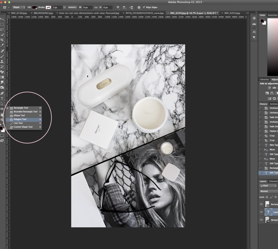
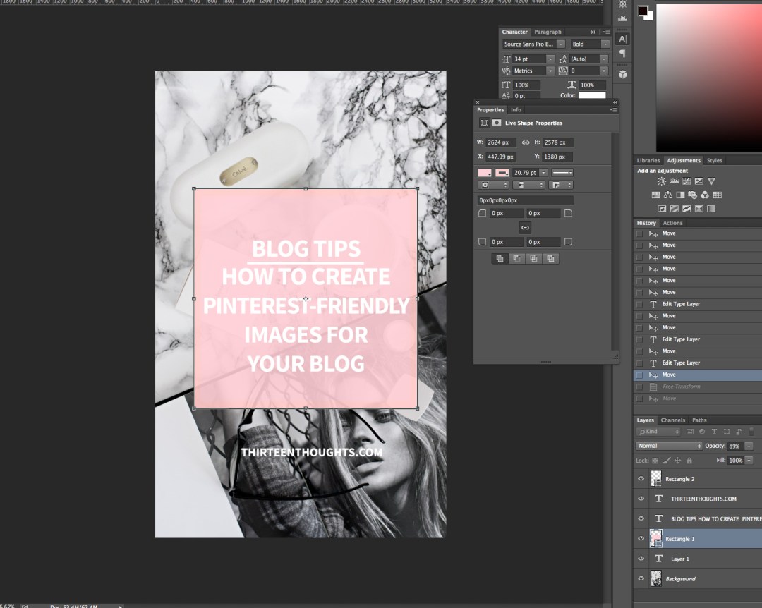
Okay, so after I’m done editing my image in Photoshop, I’ll often crop it to elongate it a little. Then, I select a rectangle tool and create a rectangle overlay, usually right in the center of my image.
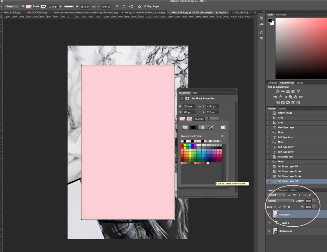
I’ll then change the color and adjust the opacity. By adjusting the opacity, I make my triangle a bit see-through, but opaque enough for my text to be easy to read. This is important because we obviously want our text to be easy to read- which is why I usually like to add the rectangle overlay in the first place. Make sure that your colors go well together, and aren’t too bright which can make your text difficult to read. You can add an overlay to the entire image, like here:
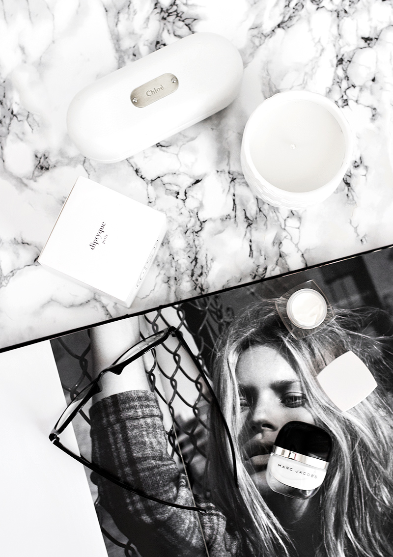
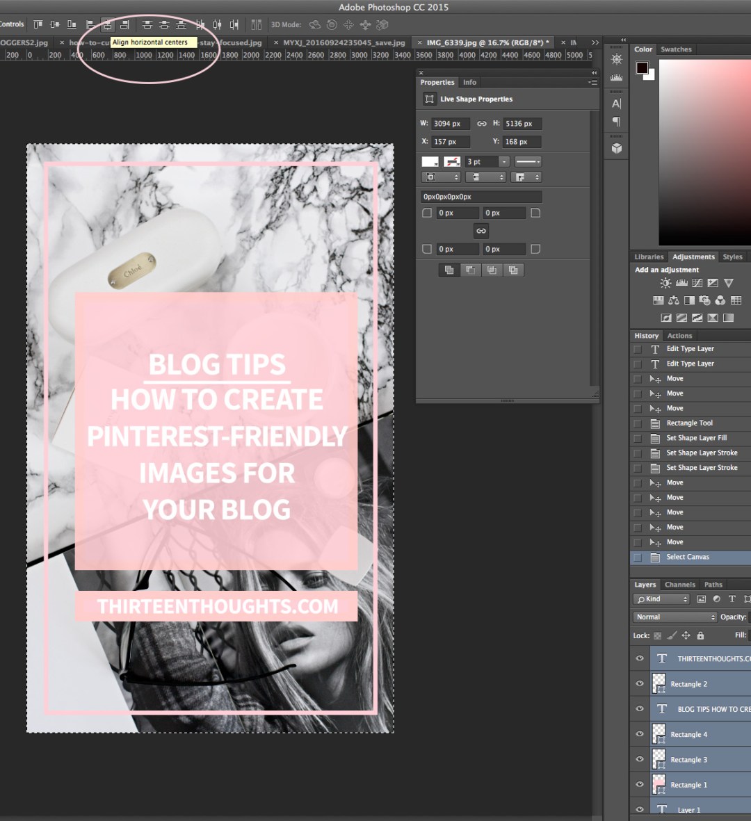
… or you can only add it to a section of your image. For me, it was a bit of a trial and error, before I found which style works best for me and gets the best results (most re-pins). Remember that it’s a good idea to switch things up and over-branding your pins doesn’t work. You do not want all of them to look the same; switch things up a little- you can even upload as many as 4 completely different pins to Pinterest, all linking to the same blog post.
After adding my overlay, I add some text. Play around with fonts and see which one you like the best- stick to it! According to Pinterest, text overlays should be designed for clicks and should lead people to action. Make sure that your pin includes information that will help the user to decide that they want to click and visit your blog. I also like adding my blog address somewhere at the bottom.
After I’m done adding my overlays, I align everything so it looks even. I select my rectangle and text layers while holding shift and select all by holding command+A. I then click on “Align horizontal centers” which automatically aligns everything for me, so it’s nice and even. The last thing I do is saving my image for web and resize it.
Once I’m done with editing my Pinterest image, I save it as a .psd file. That way, I have a template saved for later, and won’t have to go through the entire process again for the next images, which saves me a lot of time. I already have my favorite fonts, colors, and overlays all ready to go along with multiple different templates.
This post was requested a while ago and I’m currently working on another fun Pinterest post, which will outline how I reached 10,000 followers on Pinterest in 7 months, so keep an eye out for that one, too.
To see a full list of my Pinterest tools I use to grow my blog, see this post. For a list of ALL of my blogging resources, including my favorite affiliate networks, see this post.

42 Comments
Ambar Syed
October 7, 2016 at 6:56 amSuch a useful post Paula – thank you for sharing – I really need to learn how to use Pinterest effectively and your guides are perfect for that. :)
Ambar x
http://www.herlittleloves.co.uk
Paula @ lifestylegleam.com
November 1, 2016 at 10:38 amThank you so much Ambar!
Megan McCormick
October 7, 2016 at 8:44 amI will definitely put these tips to good use – thanks!
http://www.masteringhealth.co
Paula @ lifestylegleam.com
November 1, 2016 at 10:38 amYou’re welcome!
Elizabeth Hisle
October 7, 2016 at 8:44 amHell. Yes. I have wanted to know how to do this for ages, but it’s very hard for me to just “figure things out” in Photoshop other than the basics. I would have never guess this on my own! Look out world, here I come.
http://waltzandwillow.com/
Paula @ lifestylegleam.com
November 1, 2016 at 10:39 amHaha yessss! So happy you found it helpful!
Alina
October 7, 2016 at 9:21 amEvery time a day goes by and I have yet to look into Pinterest, I tut at myself. Hopefully when I settle into my new job I can finally focus some time towards it! I definitely need to look at my images first and change them length wise x
Beauty with charm
Paula @ lifestylegleam.com
November 1, 2016 at 10:39 amHope you get to explore it a bit soon Alina!
Sheila
October 7, 2016 at 10:10 amWow, this was SO helpful! I always wondered how to make Pinterest-friendly photos (with the text and everything) and now I get it. Thank you!!
http://www.insearchofsheila.com
Paula @ lifestylegleam.com
November 1, 2016 at 10:39 amYou’re welcome Sheila!
Natasha Todd
October 7, 2016 at 10:54 amAhh you put together so many amazing helpful posts! Can’t wait to try and create some better images for my blog! Thanks :) x
Tash
natashatodd.blogspot.co.uk
Paula @ lifestylegleam.com
November 1, 2016 at 10:39 amAww thanks so much Tash!
Emily Trinh
October 7, 2016 at 11:03 amThank you for sharing this informative and detailed explanation. Pinterest is something that I definitely have to look into.
http://www.emilytrinh.com/so-there-she-was/
Paula @ lifestylegleam.com
November 1, 2016 at 10:39 amYou’re very welcome Emily, thanks for stopping by!
Katie S.
October 7, 2016 at 11:24 amI am planning on doing some serious work this weekend on this! I’ve been saying I want to update old blog post images for months and never got around to it but I’m buckling down and just doing it. I’ve been trying out a couple different Pinnable image styles and it’s so tough to decide which to use! I’m definitely going to be taking your tips! And saving a .psd is such a good idea. I don’t know why I didn’t do that sooner!! Thank you as always!! <3
Paula @ lifestylegleam.com
November 1, 2016 at 10:40 amI usually try one style for a few weeks and change it up and see which works best and usually stick to that one ;)
Mikéla Davelyn
October 7, 2016 at 1:08 pmGreat tips hun :)
xo, mikéla / simplydavelyn.com
Paula @ lifestylegleam.com
November 1, 2016 at 10:40 amThank you!
Millie Robinson
October 7, 2016 at 4:22 pmThis is such a helpful post! x
http://www.abeautyromance.com
http://www.abeautyromance.com
Paula @ lifestylegleam.com
November 1, 2016 at 10:40 amYay, thank you!
Dea Andriany
October 7, 2016 at 7:00 pmThank you for this post, Paula! I need to start adding text to my picture right now, I did start using vertical image after reading your post, but not text.
Selene Addicted
Paula @ lifestylegleam.com
November 1, 2016 at 10:40 amYou’re so welcome Dea!
Christine C.
October 7, 2016 at 9:57 pmSeriously, such a helpful post! I’m currently in the process of finally figuring out Photoshop. It seems so overwhelming to me, ha! It’s one of my goals to increase my Pinterest followers so I’m going to try these tips to see if it helps!
Paula @ lifestylegleam.com
November 1, 2016 at 10:41 amThank you so much Christine! It is a little overwhelming at first, mainly because there are just so many options! Camera Raw is very easy to work with though!
Mary Ann
October 7, 2016 at 10:15 pmThank you so much… learned a lot from this post… can’t wait for your next post
http://peppermintcrinkles.blogspot.com
Paula @ lifestylegleam.com
November 1, 2016 at 10:41 amAww thank you Mary Ann!
Lindsay (Nail That Accent)
October 8, 2016 at 9:12 amLove this post girl. You killed it!
How did you create the outline pink rectangle? Is that a rectangle too?
Paula @ lifestylegleam.com
November 1, 2016 at 10:41 amYes, it is a rectangle, but only with a border and no fill!
The Gossip Darling
October 9, 2016 at 9:59 amOkay so this is going to be printed and pinned to my creative board!
Thanks for the great advice!
XO
Paula @ lifestylegleam.com
November 1, 2016 at 10:42 amHaha yay thanks Mel!
Tess_Sequins are the New Black
October 9, 2016 at 2:21 pmYour posts kill it every time, I learn so much from you <3
xx Tess | Sequins are the New Black
Paula @ lifestylegleam.com
November 1, 2016 at 10:42 amAwww thank you Tess!
A"ichatou Bella
October 10, 2016 at 12:12 pmYour knowledge is so dope- TYSM for sharing.
xo,
A"ichatou Bella
http://www.stilettosandstandards.com
Paula @ lifestylegleam.com
November 1, 2016 at 10:42 amYou’re welcome. x
Mona Ahmed
October 14, 2016 at 2:08 amI just did one lol thanks paula! you’re always so helpful =)
https://makeupwithmona.blogspot.com/
Paula @ lifestylegleam.com
November 1, 2016 at 10:42 amYay! Thanks so much Mona! :)
Rebecca Ellis
January 4, 2017 at 7:42 pmI have always wondered how people edit these! Thanks for sharing, I’ll definitely be reading your other posts to! X
http://www.sheintheknow.co.uk
Paula @ lifestylegleam.com
June 19, 2017 at 5:41 pmThanks Rebecca!
Kashma7
June 19, 2017 at 4:44 pmWhat great tips, Paula! You have given me the courage to start my own blog. It is really in the infancy stage, but you gave me the courage to start and your tips are really helpful. I am now off to try what you suggested. Thank you for sharing your experience with us on this blog and in all other posts you do!
http://www.kashma7.com
Paula @ lifestylegleam.com
June 19, 2017 at 5:42 pmAww you have no idea how happy that makes me!! You’re going to love blogging! :)
Emily@socialbuzzhive
August 1, 2018 at 9:38 amI love the style and cohesiveness of your blog. It gives you a very calming, relaxed feeling! :-)
Paula @ lifestylegleam.com
August 1, 2018 at 10:36 am`Thank you so much, Emily!