If you’re looking for a beautiful greige color, Sherwin Williams Agreeable Gray is the ultimate. This color is incredibly versatile and perfect for so many applications! Learn about Agreeable Gray coordinating colors, where to use it and so much more!
Agreeable Gray is the prettiest neutral. It’s not specifically gray or beige – it’s a soft, warm greige. Use it on walls, cabinetry, trim and beyond. In fact, it’s probably the most popular greige color around – learn why in this comprehensive color guide.
Let’s take a deep dive into the number one selling paint color at Sherwin Williams!
If there’s one thing I know for sure after my years of homeownership, it’s that choosing paint colors is harder than anyone wants to believe. After years of sampling paint colors in every room of our homes, we’ve made plenty of mistakes – and we still do.
That’s why I’ve created a detailed series of paint color guides and tips that can make your decisions easier. Studying a few of your favorite paint colors is the best way to make a decision you’ll love for a long time to come!
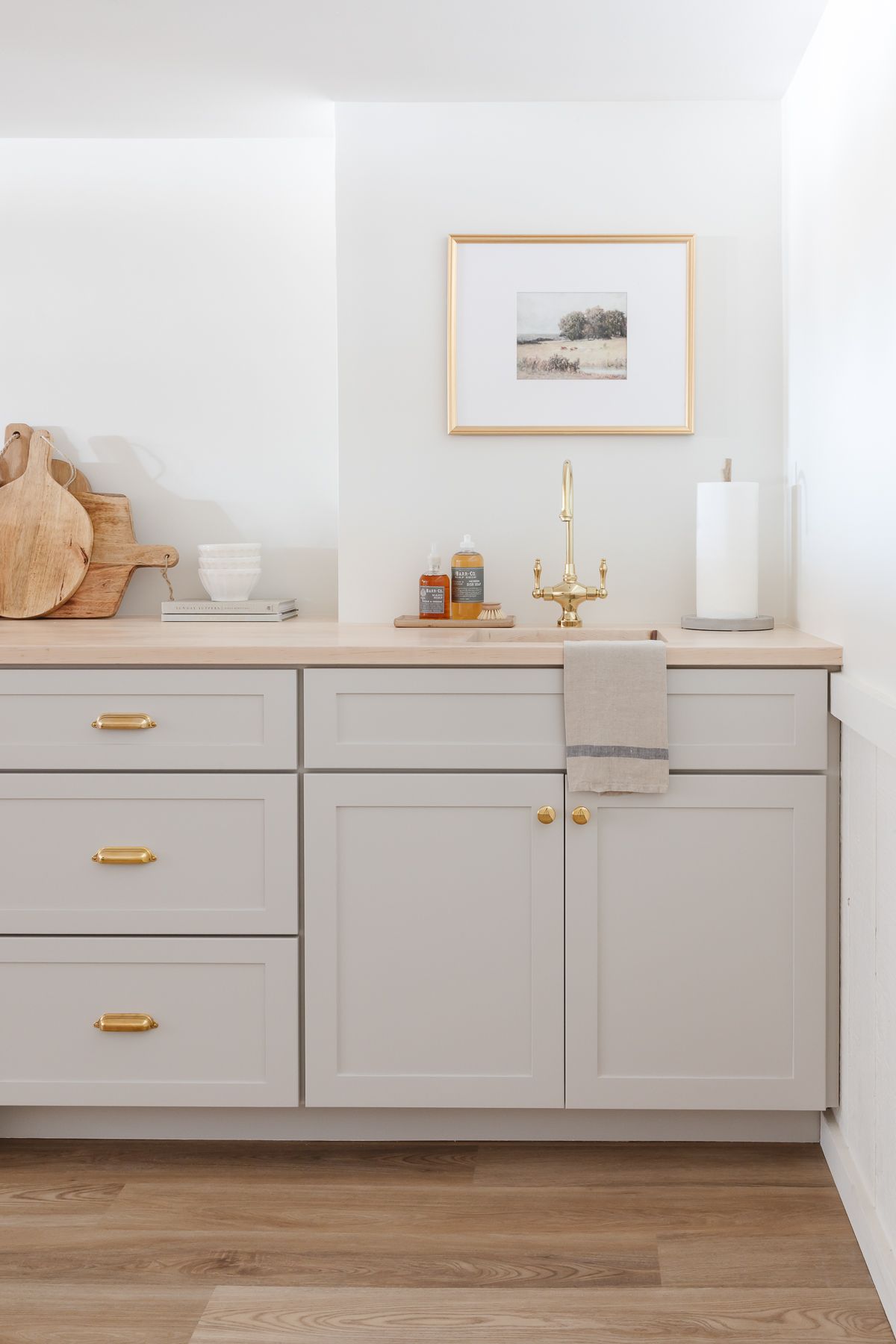
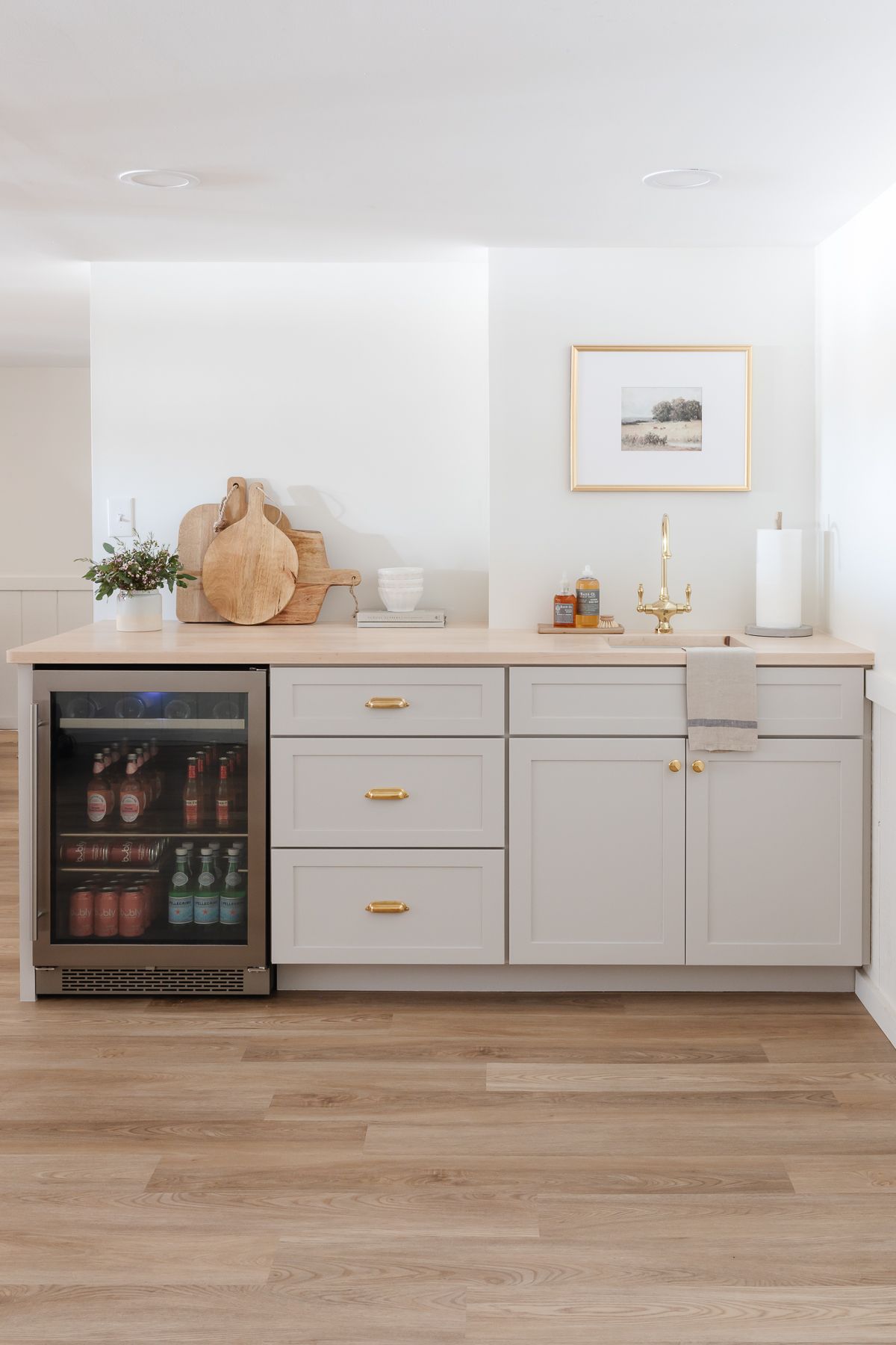
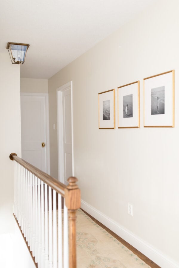
Agreeable Gray is a chameleon color that looks different at different times of the day and with different lighting. In our home, it looks a little cooler and more gray because we used it in the basement, where there is little natural light.
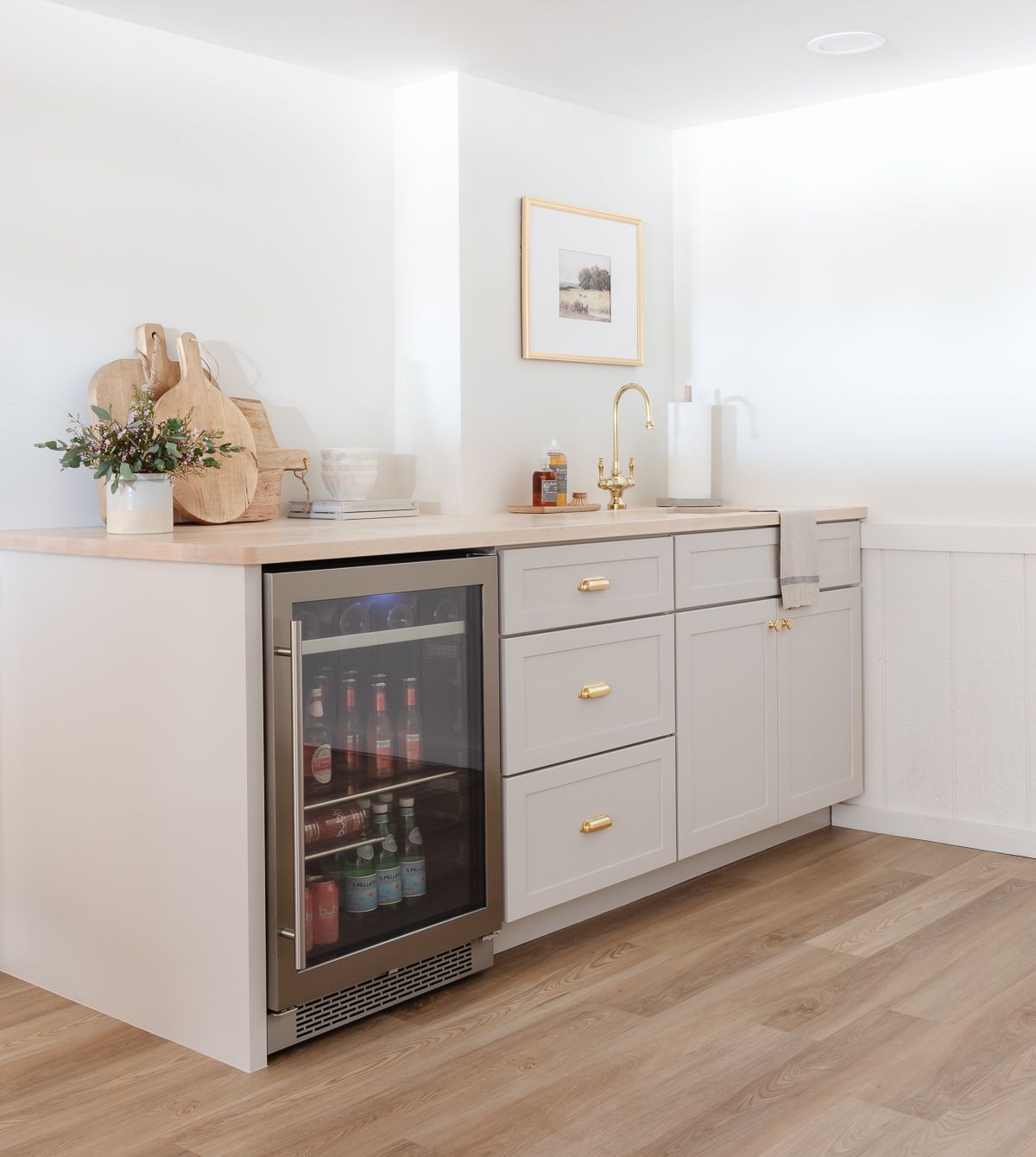
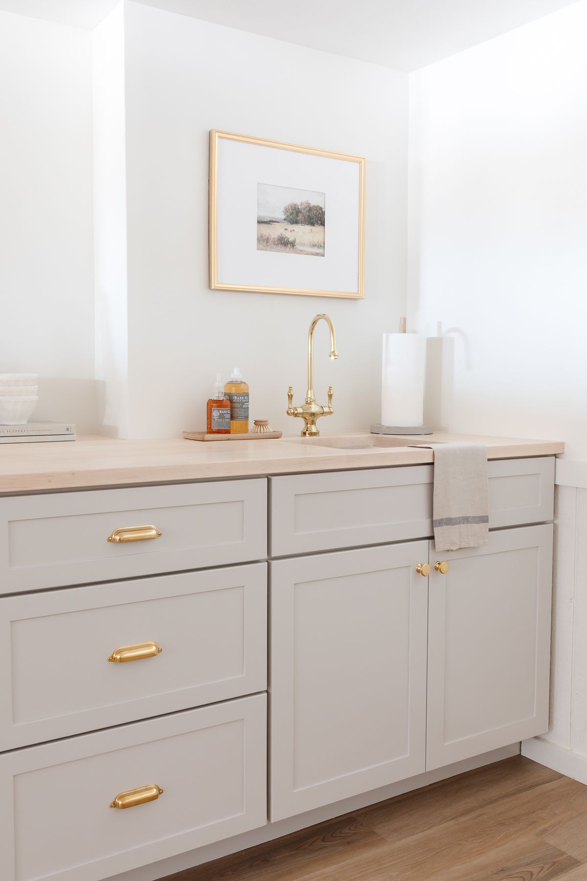
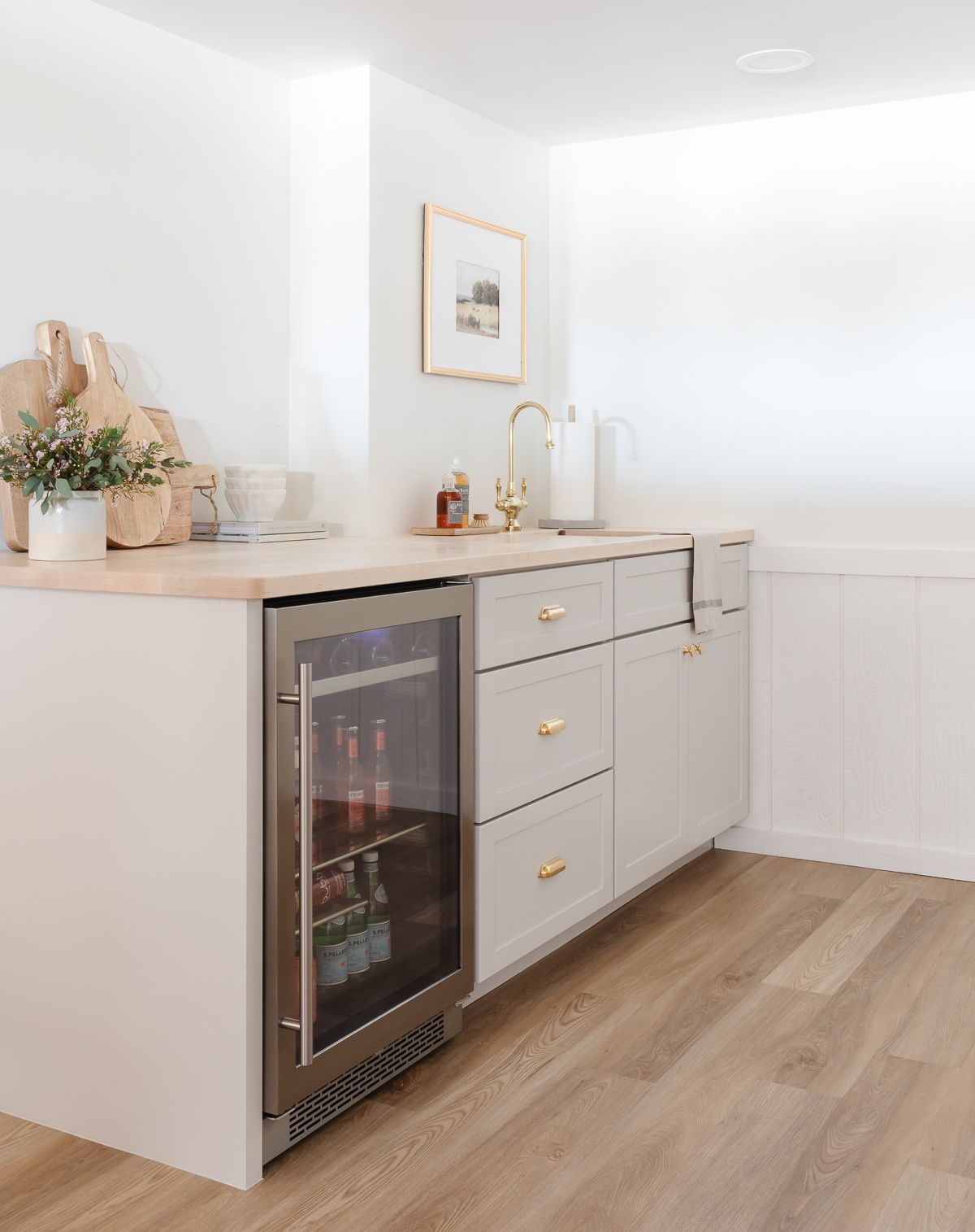
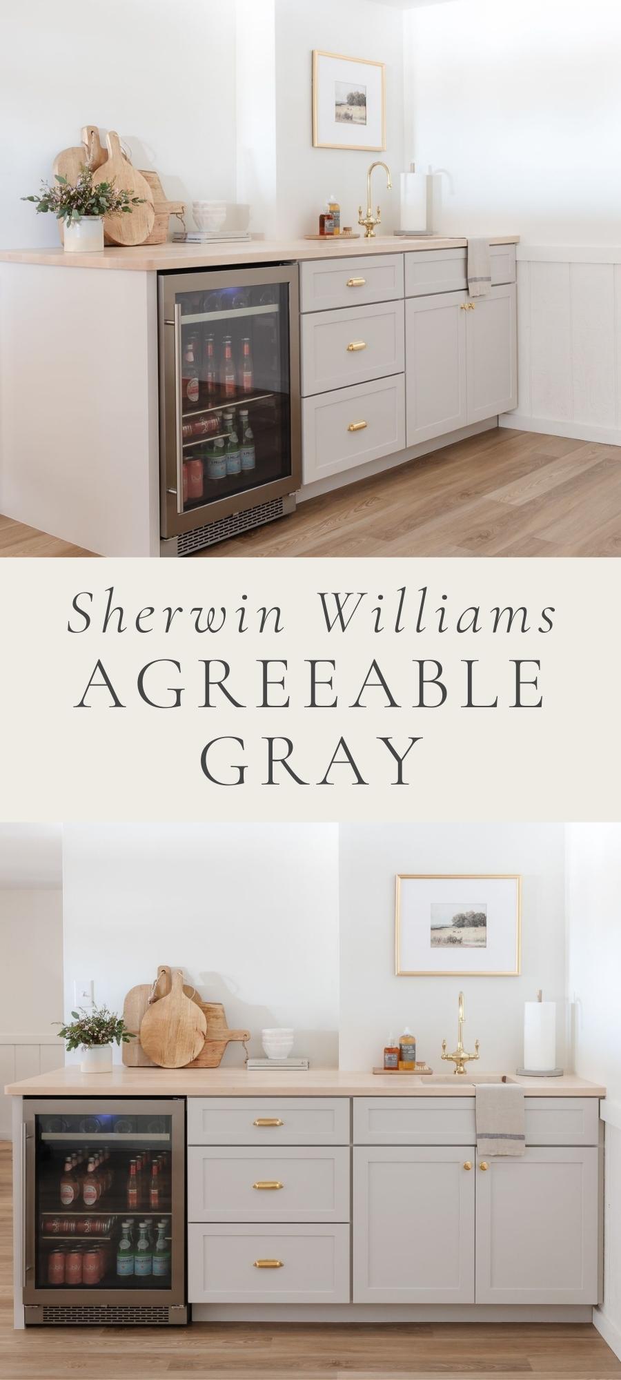
I’ll showcase this color in a variety of beautiful spaces throughout this post – including the cabinets of our new basement bar (click through for all the details and shopping sources for this space).
Why You’ll Love Sherwin Williams Agreeable Gray
- A perfect greige
- Beautiful mid-tone color
- Wonderful neutral for open floor plans
- Pairs well with many coordinating colors
Sherwin Williams Agreeable Gray Undertones
To get the perfect warmth of a true greige, a paint color has to have warm undertones. Unlike many other greige tones, Agreeable Gray doesn’t show a lot of colors in its undertones, making it easier to pair with other colors.
This color features hints of these undertones:
- violet
- green
- blue
Agreeable Gray LRV
What is LRV and why does it matter?
LRV stands for Light Reflectance Value – click through to read all about it. It’s the measure of light a color reflects or, in other words, how bright a color is. On a scale of 0-100, 0 is true black and 100 is pure white.
With an LRV of 60, this color reflects a similar amount of light to Realist Beige and Accessible Beige, two of my other favorites mentioned in my Greige Paint guide.
Agreeable Gray has a mid level LRV of 60. That means it isn’t dark, but it isn’t a bright color either. This is not a color to use if you’re looking to lighten and brighten a room.
Often, interior designers and paint experts recommend a paint with an LRV of around 60 for people who seek a shade that’s not too light and not too dark. That makes Agreeable Gray an excellent option!
In rooms that don’t feature much natural light, consider choosing a color with an LRV of above 60 – check out my round-up of beautiful Warm Whites. You can also have Agreeable Gray lightened by 25% or more when you have it mixed.
Agreeable Gray Coordinating Colors
One of the best things about this color is just how versatile it is! I’m not kidding, this is one color that plays nicely with almost everything around it. I think that’s because as a greige, it can be either warm or cool.
Here are some of my favorite color combinations for you to consider:
- Deep Grays – Choose a striking charcoal or even a beautiful black (as seen in the windows below) for a beautiful contrast. This will make Agreeable Gray read as more of a creamy beige.
- Navy Blues – One of my favorites is Benjamin Moore Hale Navy. It is a beautiful, deep navy that looks good with so many colors.
- Greens – Fresh shades of green, ranging from soft mossy tones to deep evergreen, will look beautiful when paired with Agreeable Gray.
Trim Colors for Sherwin Williams Agreeable Gray
Agreeable Gray has warm undertones that make it easy to choose a beautiful trim color to complement it. Just pair it with a warm white and you will have a perfect match.
Here are some warm whites that I’ve used that work beautifully with Agreeable Gray:
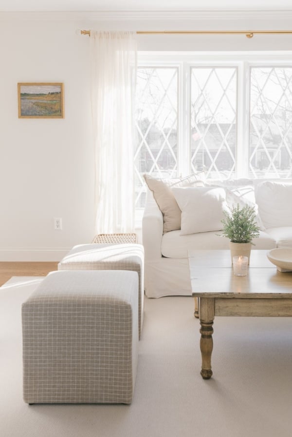
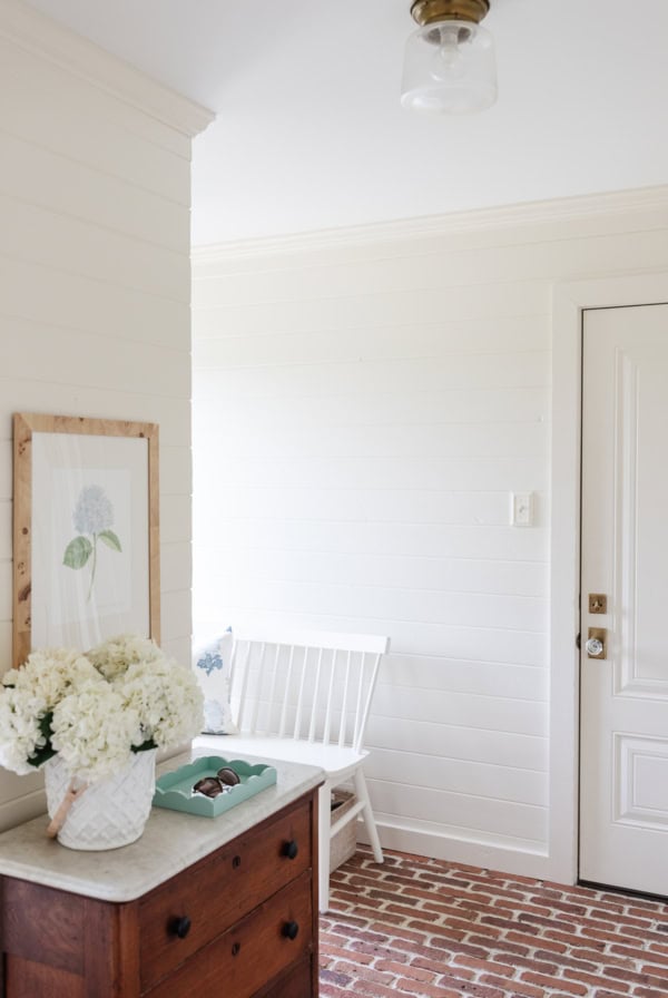
- Benjamin Moore Swiss Coffee – a soft and creamy warm white (we used this throughout our basement renovation and you can see it paired beautifully with Agreeable Gray in these photos!)
- Benjamin Moore White Dove – a warm white with a slight greige undertone
- Simply White – A favorite white with the slightest warmth.
- Sherwin Williams Everyday White – a perfect creamy white
- Sherwin Williams Zurich White – another warm white with a gray/greige undertone
Agreeable Gray vs Repose Gray
Repose Gray is a beautiful greige tone that is often compared to Agreeable in searches. With an LRV of 58, Repose is a touch darker and reads a little more of a true gray vs beige in this comparison.
Agreeable Gray vs Revere Pewter
Revere Pewter has an LRV of 55, making it one of the darkest greige colors before you might start calling them “taupe”. Revere Pewter has similar undertones with a touch more green in the background, and is a wonderful option if you’re looking for a richer version of Agreeable Gray.
Agreeable Gray vs Worldly Gray
Much like Repose, Worldly Gray has an LRV of 58. That makes it a touch darker than Agreeable Gray. These two colors are very similar, with Worldly leaning a little warmer with a hint more brown than Agreeable.
If you’re choosing paint samples, you might also consider Benjamin Moore Classic Gray, another one of our favorite greige colors that’s quite similar to this one.
Where to Use Agreeable Gray
This color is can be used anywhere and it looks amazing. Here are some ideas of where to use SW 7029 in your home:
- Walls – It’s especially wonderful in rooms with natural light. Don’t skip my complete guide to paint sheens so you know how to make this decision!
- Trim & Doors – Soft white walls are fabulous with Agreeable Gray as a contrast on trim and doors. Or for a seamless look that will make your space appear larger, try painting your walls and trim the same color!
- Cabinetry – We’ve used this color on our basement bar cabinets, and I couldn’t be more excited about it.
- Furniture – much like we painted our nightstands in our primary bedroom, this color would be beautiful on a variety of furniture pieces. Read more about my favorite furniture paint.
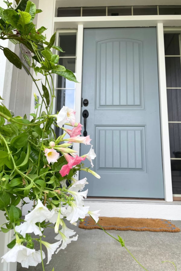
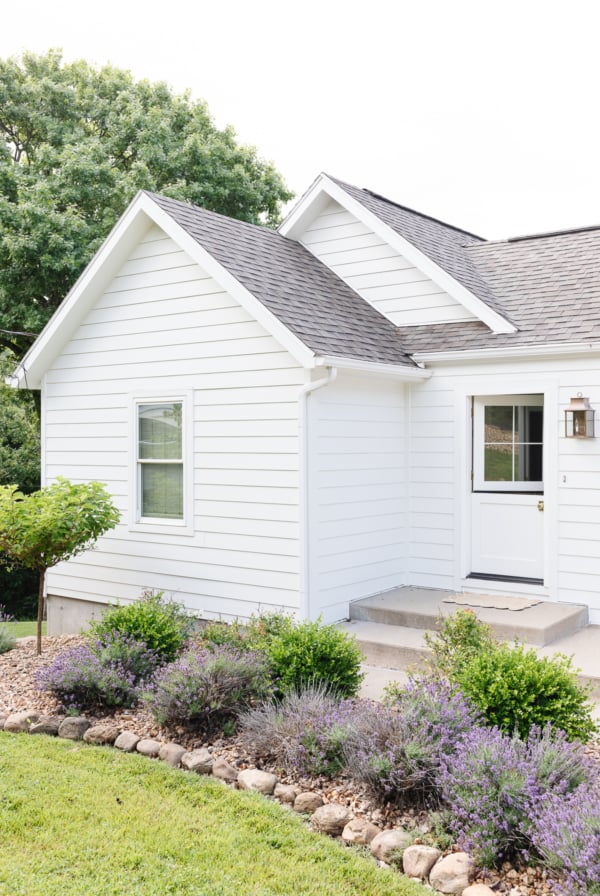
- Exterior – With its perfect blend of gray and beige, this color is a wonderful choice for home exteriors. Keep in mind that colors will always appear much lighter on an exterior than an interior surface, as you can see in the following photo. Check out my tips and tricks on how to select exterior paint colors here.

Tips
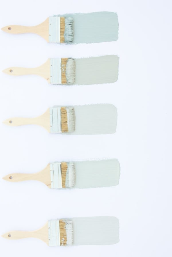
- Get Samples – Go to your local paint store or order samples online. Read all my best tips about Paint Samples here!
- Pay Attention to Lighting – Look at the samples at different times of the day. Pay attention to how different lighting affects the color throughout the day.
- Hold Against Surfaces – Hold your samples up to surfaces that run into your walls. For example, consider your cabinetry, countertops, hard floors, carpeting, fireplace surrounds, and trim.
- A note of caution: Make sure the coordinating color you choose to go with Agreeable Gray isn’t too creamy or yellow. This pretty greige may have warm undertones, but it’s still gray, after all!
- Choose a cleaner white with a touch of warmth or just a true white to keep things simple. Read all about The Best Trim Paint here, along with my tips for Painting Trim White!
Frequently Asked Questions
Yes – and will be popular for a long time to come! It’s a wonderful greige that features a perfect LRV and strikes the perfect balance between gray and beige.
The answer is greige! Greige is a great way to move away from cooler gray colors that have dominated the last decade in design. Choose a color with more warm brown undertones, like Agreeable Gray, for a long term investment in your home.
Join Our Community
Let’s keep in touch! Receive exclusive content, including never-seen-before photos, our favorite home decor DIYs and more!




I just painted my kitchen cabinets agreeable gray, and the island rock bottom. My main floor is all open. The wall color for the entire main floor is shoji white. When I was deciding on colors, it looked like there was enough contrast between agreeable gray and shoji white that they would work ok together. But now that it is all painted Im not sure. Have you seen shoji white and agreeable gray together? Is it workable?
Hi Lindsay!
I know Shoji has some greige and beige undertones to it, so although I haven’t seen them together, it should work well with Agreeable Gray! While their LRV numbers are somewhat similar, you should get some more significant variation through the sheen on the cabinets vs the wall color as well. Read my guide to painting walls and trim the same color to learn more about how that works!
Enjoy,
Julie
I have a west facing bedroom with one window. I am liking Agreeable Gray….how much would it change it if was lightened by 10%. ? The room’s primary colors are blue/white/beige print bedding, black iron headboard/footboard, black nightstand and black console table and an inherited cream chest of drawers.
Typically, you can lighten by 25% or 50% – it helps a lot.
So beautiful!
What counter top is that!?
Thanks!
Hi Stephanie,
You can read all about them in this Butcher Block Countertops post.
Enjoy,
Julie