
Choosing the perfect gray can be hard, but it doesn’t have to be. Let me introduce you to Sherwin Williams Knitting Needles (SW 7672). You’ll love this soft neutral that will blend seamlessly into any design style or color scheme. It’s the perfect mid-tone gray!
I’m often asked what paint colors we use throughout our home. Because of that, I’ve shared a lot of posts about paint over the years. My goal is to help you feel confident in your color choices and to skip over the colors that won’t make you happy.
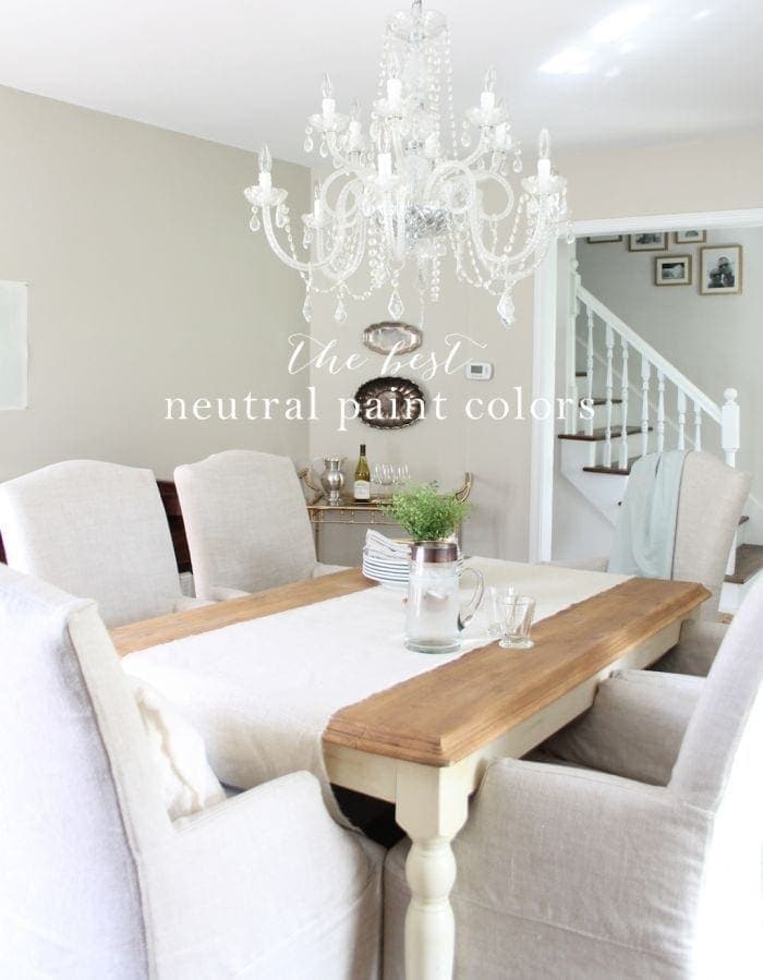
I love a neutral color palette and how it makes a home feel warm and inviting. If you’ve taken a tour of our former Colonial home, you’ve probably noticed that it’s almost all neutral colors, accented with hints of color.
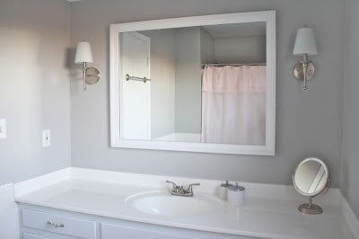
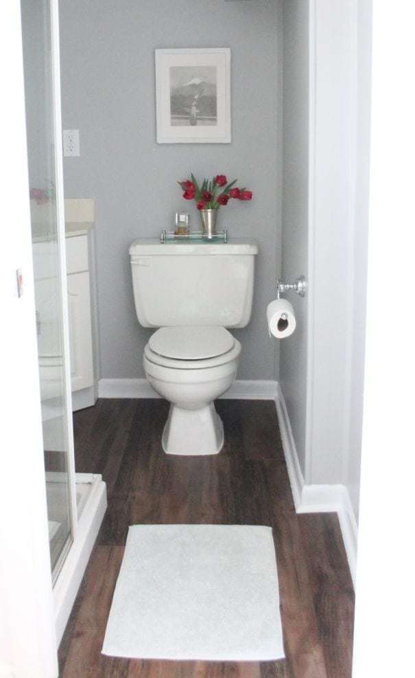
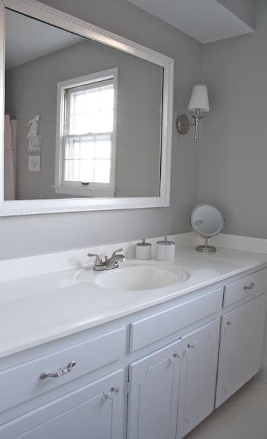
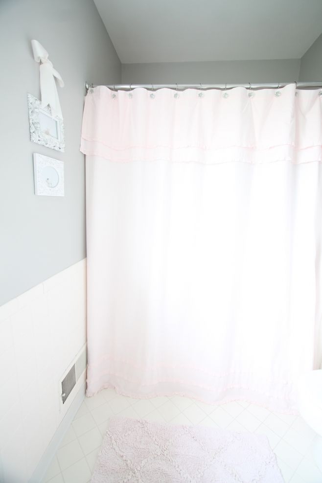
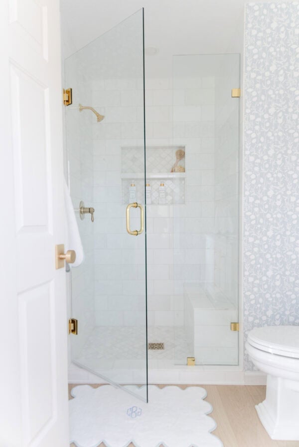
We used Sherwin Williams Knitting Needles in the bathrooms of the Colonial – the basement bath, girls’ bath, and master bath. We chose it for all three spaces to help the home feel cohesive. Plus, it truly is the perfect gray. Even though each bathroom had unique features and lighting, the color looked amazing in each space.
Since then, we’ve had a few friends use it for their living rooms as well. It works just as well for large, open spaces as it does for small ones. It’s an all-around versatile color.
You may also be interested in how to choose the best ceiling paint, the best paint for furniture, and the best paint sheens for your spaces.
But for now, let’s go over everything you need to know about SW Knitting Needles!
Why You’ll Love SW 7672
- A beautiful mid-tone
- Soft and subtle
- Pairs well with many colors
- The perfect gray!
SW Knitting Needles LRV
What is LRV and why does it matter? It stands for light reflectance value, and essentially it’s the amount of light that bounces off a given color. On a scale of 0 – 100, an LRV of 0 is the darkest (black) and 100 is the brightest (white). So the higher the number, the lighter a color will be.
Knitting Needles has an LRV of 53, planting it solidly in the mid-tone range. This means it won’t make a dark space feel darker, but it also isn’t going to brighten a space. It’s simply a perfect, neutral backdrop to any space!
Like any color, Knitting Needles may appear different depending on the lighting. In a space with amazing natural or artificial lighting it will seem brighter than it really is. In a space without much light, it will appear darker and moodier. Or the color may change throughout the day as the lighting changes.
Knitting Needles Undertones
SW 7672 is one of our favorite neutrals for a reason. It’s hard to find a gray that’s not too warm or cool, or that doesn’t have overpowering undertones. This gray is perfect on all counts.
I have heard that SW Knitting Needles can have the slightest purple undertone. Remember, this does not mean that it looks purple. Every time we have used Knitting Needles, it has appeared like a true gray. The color has been soft and subtle, and I have never noticed any distracting undertones.
Undertones are just what they sound like – colors that run underneath the dominant color. In many cases your eyes don’t even perceive the undertones, although they can come through in certain lighting.
Where to Use Sherwin Williams Knitting Needles
The short answer is anywhere. The longer answer is that Knitting Needles is a good fit for any design style, from modern to farmhouse and everything in between. It is clean and fresh without being too cold.
Lighting will make a big difference on where you choose to use this color. If you’re trying to create a light and bright feeling, but your space is small and doesn’t have much natural light, then this isn’t the color for you. You’d be better off choosing a gray with an LRV of 65 or higher.
However, if you have an open space with a lot of natural light, and you’d like a gray that holds its color, then Knitting Needles may be the perfect choice. A gray with a higher LRV could end up looking washed out in the direct light. A mid-tone gray will keep its color without looking too heavy.
SW Knitting Needles can be a great option for bedrooms, great rooms, bathrooms, kitchens, home offices and gyms, and exteriors. But in the end, it comes down to your spaces and your personal preferences. What are you looking for? What mood are your trying to create?
Trim Colors to Pair With SW Knitting Needles
Because it’s such a lovely mid-tone gray, Knitting Needles looks especially stunning with some contrast. You can achieve this look by painting trim white. Newly painted white trim makes any space feel clean and fresh.
Sherwin Williams Knitting Needles makes it easy to choose a white trim color. Since it’s not a cool or a warm gray – it’s right in the middle – you can pair it with a cool or a warm white and it will look lovely.
Here are some ideas for trim colors to pair with SW 7672:
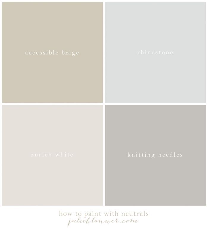
- Sherwin Williams Rhinestone – A bright white with a hint of a blue undertone. I’ve paired these two together and the result was beautiful.
- SW Zurich White – A slightly warmer white with gray/greige undertones. It’s perfect on walls and trim if you’re looking for a white with some soft color to it. We’ve used this lovely color in many rooms in our current home, including our family room and living room.
- Benjamin Moore White Dove – A warm white, but with a greige undertone instead of a yellow one.
- The best trim paint – Okay, technically this isn’t a color, but it’s too good not to share. This post is all about my favorite paints for trim and why I love them!
Accent Colors to Pair With SW Knitting Needles
You’ve maybe heard the advice to choose either tans or grays. But I say, why not use both? I think blending tans and grays can be beautiful. They work well together to create a calming neutral color palette.
The trick is to choose a tan with a slight gray undertone. Sometimes these colors are known as “greige,” because they are a mix of gray and beige. They have just the right amount of warmth in them to be inviting, while still looking at home next to a gray like SW Knitting Needles.
Here are some neutral colors I’ve used and loved:
- Benjamin Moore Pale Oak – A soft, neutral greige that creates a perfect backdrop for your furnishings and décor.
- Sherwin Williams Agreeable Gray – A slightly deeper color that leans slightly more gray than beige.
- Sherwin Williams Accessible Beige – Has slightly more beige than gray, but still has enough gray to pair with SW Knitting Needles.
- Benjamin Moore Hale Navy – A deep, rich navy can act as a neutral, because it looks good with so many other colors. I love to use it as a splash of color, such as on a small bathroom vanity.
If neutral colors aren’t your style, then a soft, neutral gray like Knitting Needles is a perfect fit for you. It will pair well with almost any accent color you can think of. Red, coral, yellow, green, aqua, blue, purple? Gray looks amazing with all of them!
If you see a purple undertone and you want to downplay it, remember to stay away from orange and yellow accents. Orange is purple’s complementary color, so it will only emphasize it more. I haven’t seen a purple undertone in my spaces, but I’m passing on the tip just in case.
Neutral Paint Palette With Gray and Tan
I highly recommend that you take the time to create a color palette for your home, even if you’re only planning on painting one or two rooms right now. It’s a great way to keep your home feeling cohesive as time goes on.
Like I said, it’s perfectly fine to blend grays and tans in a home. In fact, I think it’s beautiful and creates interesting layers! Here are a few of my best tips for creating a neutral paint palette you’ll love.
- Limit palette to 3 – 5 colors. This creates a seamless transition from room to room without making a home feel choppy.
- Grays or tans. Decide whether you want to use grays or tans, or if you want to blend them.
- Create a color board. Once you’ve chosen colors, create a small board to see if you like them next to each other. I like creating a grid of digital images on my phone or computer for easy reference later on. Now is the time to adjust any colors that don’t seem to “go” with the others.
- Keep extra on hand for touch ups. Maintaining a tight color palette makes touch ups easy. You can easily remember and find the paint colors you need. My free printable paint color chart helps, too!
Tips for Choosing Gray Paint
- If possible, test a color sample in your space. Looking at it in a store just isn’t the same.
- Paint samples on at least two of your walls, or paint a sample board that you can move to different spaces in your home.
- Pay attention to how the color looks in different lighting throughout the day, especially to any undertones that may come out in different lights.
- Remember, it’s just paint! If you don’t get it right the first time, you can always paint over it. Don’t let indecision keep you from moving forward.
You can learn even more in this YouTube video about choosing the right white paint. As you can see, it’s a subject near and dear to my heart.
Come see the cream paint palette I used in our new home and get my complimentary paint color chart to keep them all organized. I hope this helps you create warmth and comfort in your home!
Do you need ideas for those freshly painted walls? Don’t miss 17 Easy Wall Decor Ideas!
Frequently Asked Questions
Knitting Needles is a beautiful mid-tone gray. It’s not too warm or too cool, so it pairs well with many different colors, both warm and cool. It looks like a true gray to the eye, although its undertone would be considered the very slightest purple.
Sherwin Williams Knitting Needles is SW 7672. It is part of the Sherwin Williams Timeless Color Collection and can be mixed in either interior or exterior paint. It would be a beautiful color wherever it’s used.
More of the BEST Neutral Paint Colors
Looking for more soft white and creamy paint colors? Don’t miss my detailed discussions on the following color options:


Your neutral palette has inspired me to paint the two apartment I’m moving into. I’m using PPG brand paints. The colors I’m using are similar to what you have here. I’ll be using Aria PPG1001-02 in the kitchen and living room. Fall Chill PPG1003-1 in the dining room. In the bedroom, closets, hallway and office I’m going to use Silver Feather PPG 1002-1, and in the bathroom I’ll use Thin Ice PPG1001-3. I’m using Delicate White PPG1001-1 on the ceilings, doors, and trim. I’ve always liked PPG and I think these colors will generate a similar effect to what you have. I think these colors are a bit less contrasting compared to yours though. Please let me know what you think.
They all sound so beautiful! Hope you enjoy your new home!
Wow, your colors really inspired me. So i bought sherwin williams superpaint zurich white for the bedroom and rhinestone for the bathroom. Omg turned out beautiful. Decided to paint the rest of the house and ran into a ton of complications and personal prefernces. Wow picking a color is not easy. Realized my house does not do good with warm colors or it could have been the type of paint i used. I thought the ballet white would have been beautiful for my dark home but i think the type of paint i used didnt pickup the pigment correctly. I had used bm natura and sw emerald. Both produced terrible results. So will continue with new color edgecomb gray (turned out good used bm regal for main area. After much complications i finally decided to use sw rhinestone and zurich white in the kithen and other bedroom, respectively. Since i had excellent results with sw superpaint i’ll stick with that. That was before i thoroughly read your blog realizinng that certain paints do not produce good color. I was able to return the bm natura which was really difficult to apply and paint was horribly ugly. I also was able to return sw emerald which looked horrible as well. I didnt know that the paint you select for your color does make a difference. Both paints were supposedly highend. Wish i would have read your whole blog prior to this project. I love your colors and your appreciate all of your advice. You know your colors. ????
I’m so sorry for your frustration, but glad you found a couple of colors here that you love! I love the super paint and proclassic. They seem to apply the best and be relatively easy to wipe clean. Hope you enjoy your freshly painted home!
Is it considered alright to paint your entire house the same color? No varience at all? If I wanted to use a 2nd color what would be your suggestion? As you can see I am terrified to make a decisions here. Sorry!
Absolutely! If you’re really scared, do the second color one shade darker or lighter, it works like a charm!
Julie I’m sorry more questions. Would you go with paint colors from your 1st home or 2nd the cream paint colors. I did find your 7 tips for adding more light. It’s just I’m nervous we have painted this house a lot & can’t find what looks good. But we have done Sherwin Williams Coconut so I don’t want anything with yellow, sorry.
Thank you so much!!!
It’s personal preference, but given what you’ve described, that’s what I would do.
Julie will the Soft Chamois (I do not want yellow) be good for all rooms even bedrooms? I definitely need light. I can’t find your post on 7 ways to add light please direct me.
Absolutely! It’s beautiful in various light settings and has great undertones. It would definitely add light to your home.