
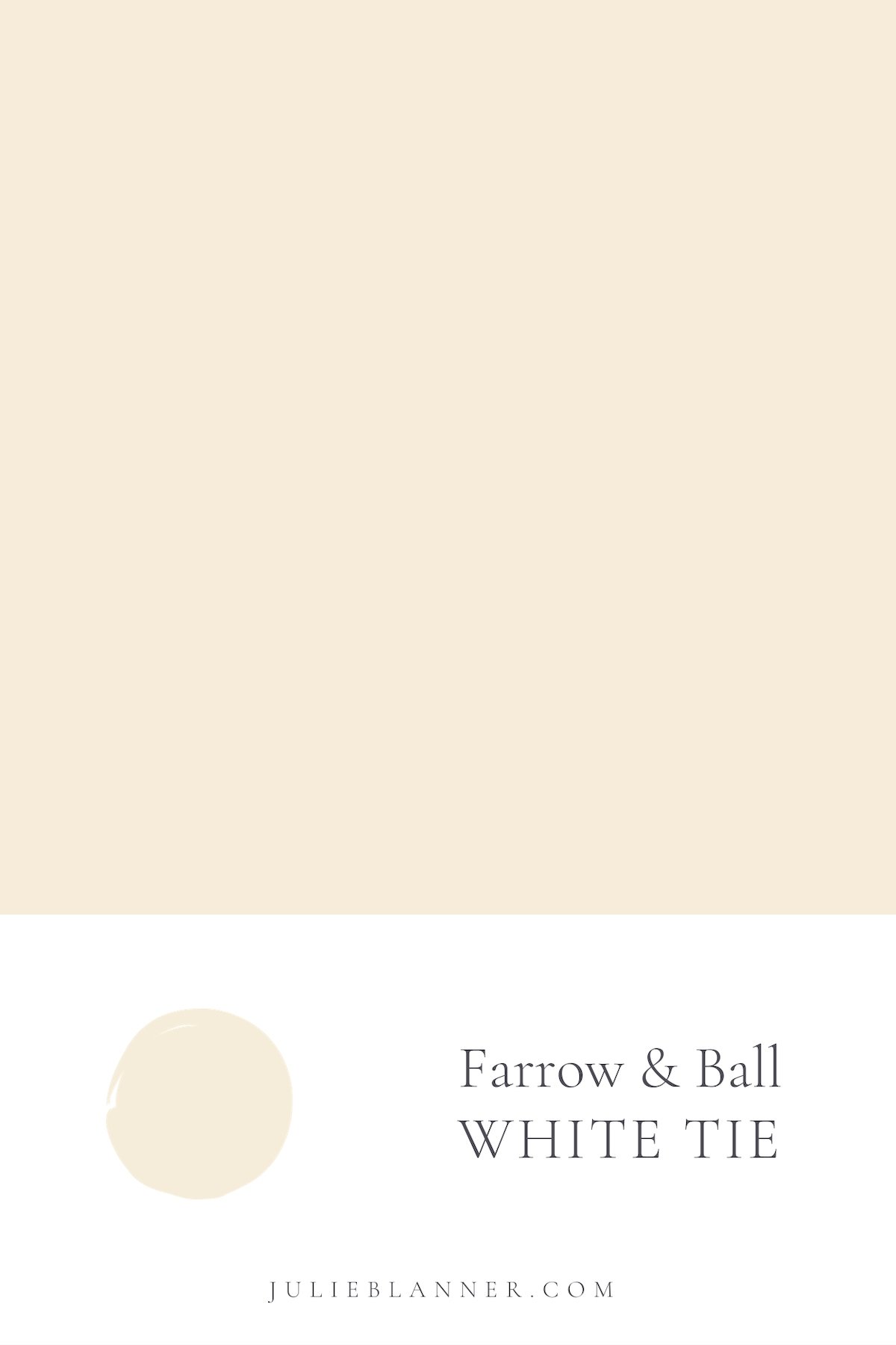
Get all the details about one of my favorite cream paint colors, Farrow & Ball White Tie.
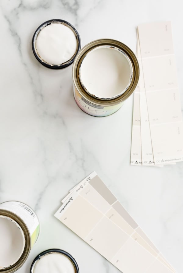
With each Instagram post I receive questions about our paint colors. I don’t take selecting paint colors lightly. In fact, I slightly panic over them. Okay, completely panic over them. But you don’t need to. I have you covered!
We utilize the help of painters and once it goes on, I feel committed to the color, so I want to make sure I get it right, the first time.
It was our hope when we purchased our current home we would just use 1-2 paint colors for the entire home. However, the lighting is vastly different in different areas of our home, so I used several different shades of cream to best fit each space.
To help you decide which paint color is right for you, I’m breaking them down with pros and cons of each, where they’re best used, etc.
Farrow & Ball White Tie
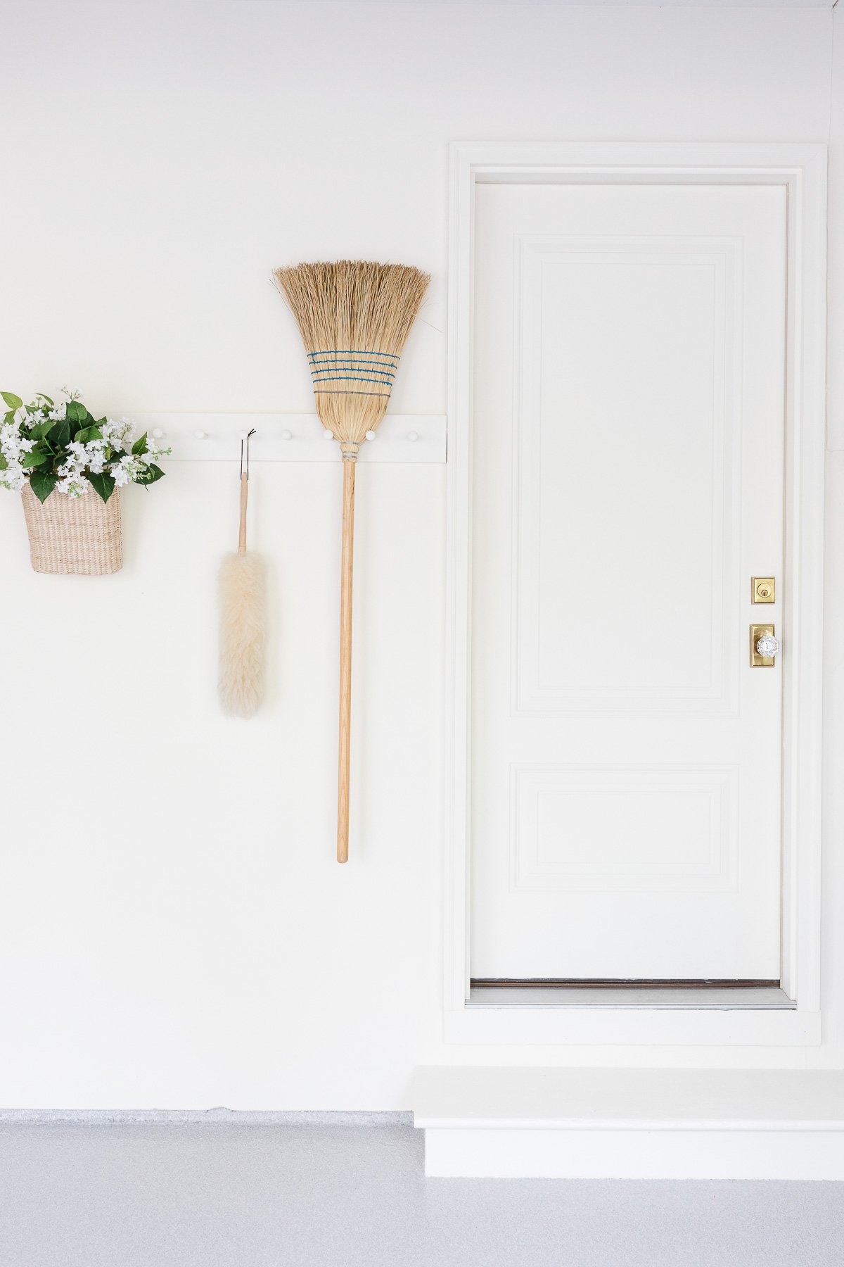
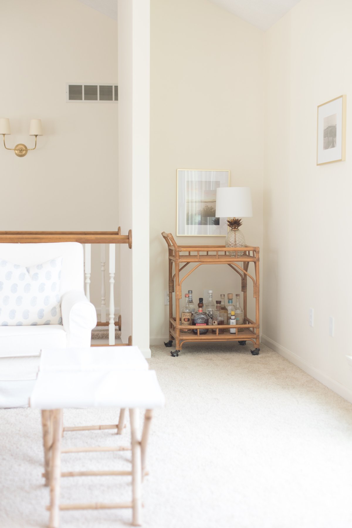
We first used Farrow & Ball White Tie in the garage. Yes, the garage. I wanted it to feel bright, cheery and fresh and we accomplished just that with Farrow & Ball White Tie.
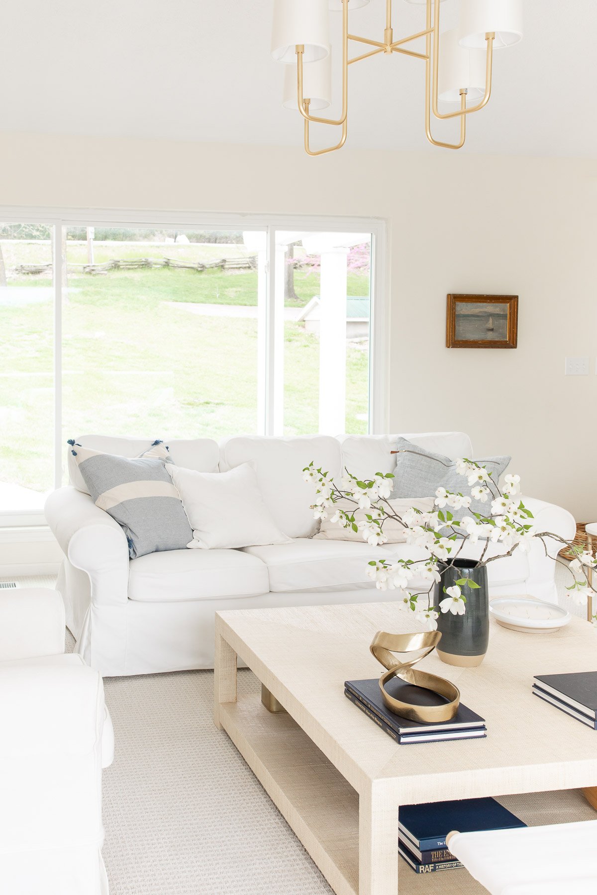
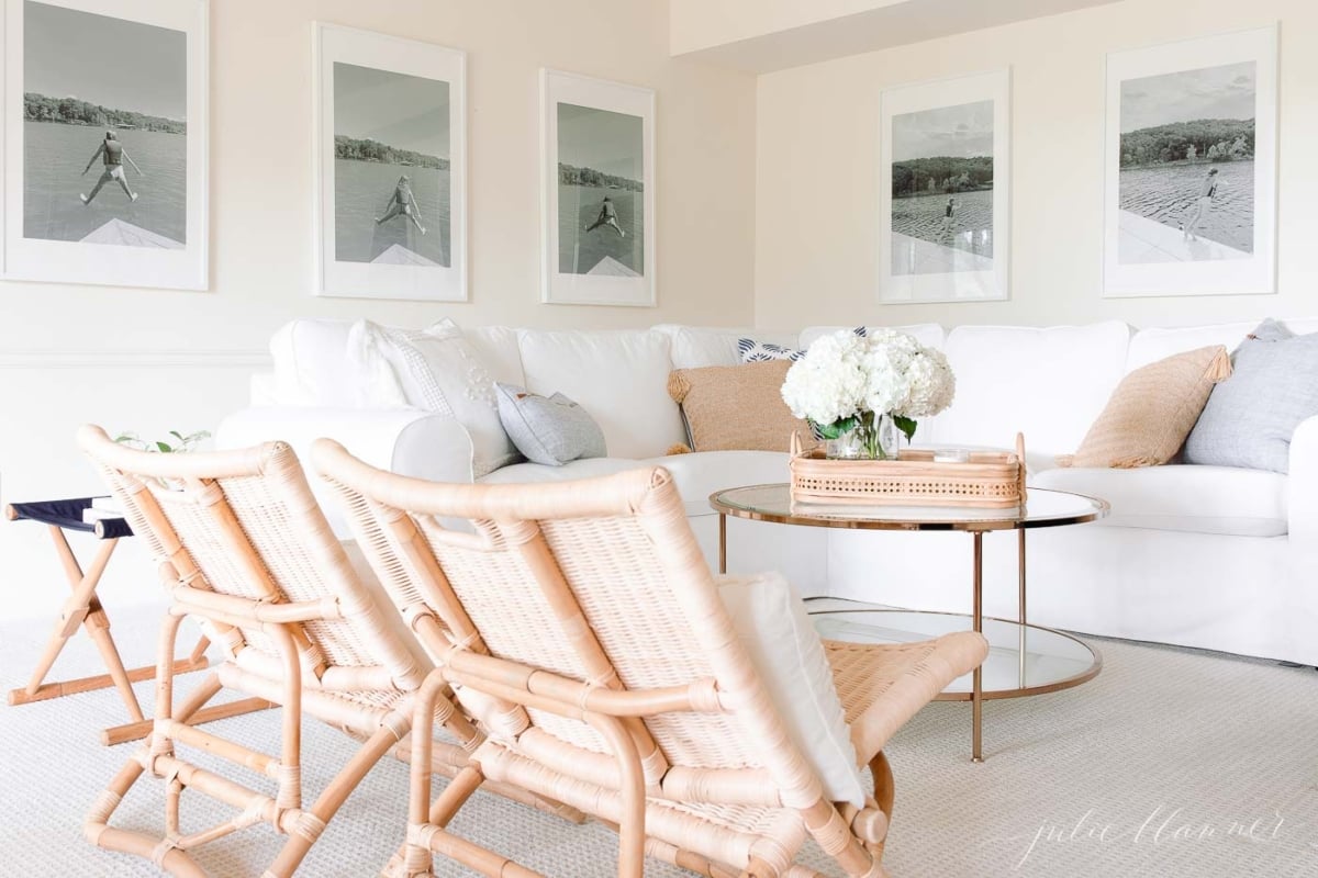
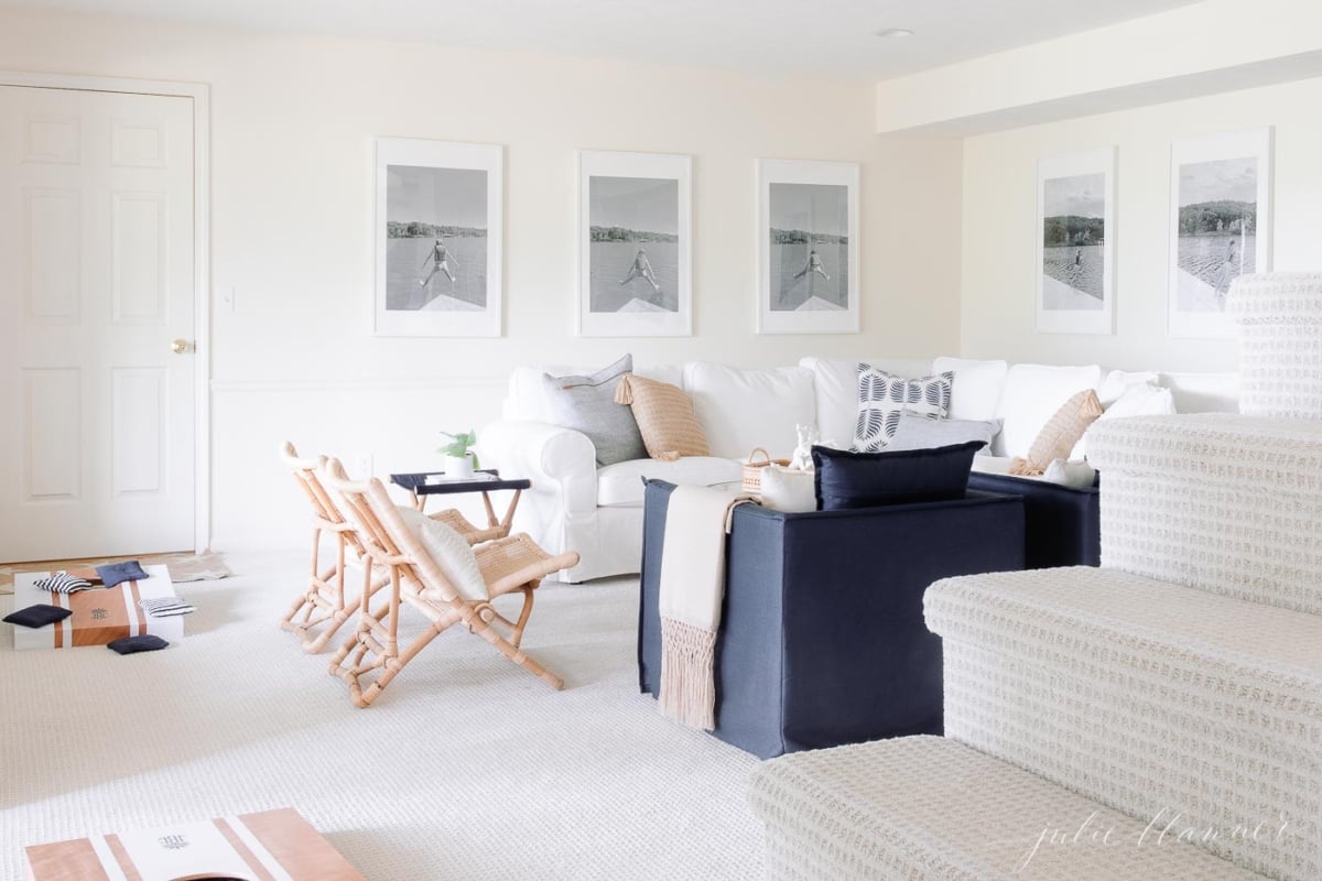
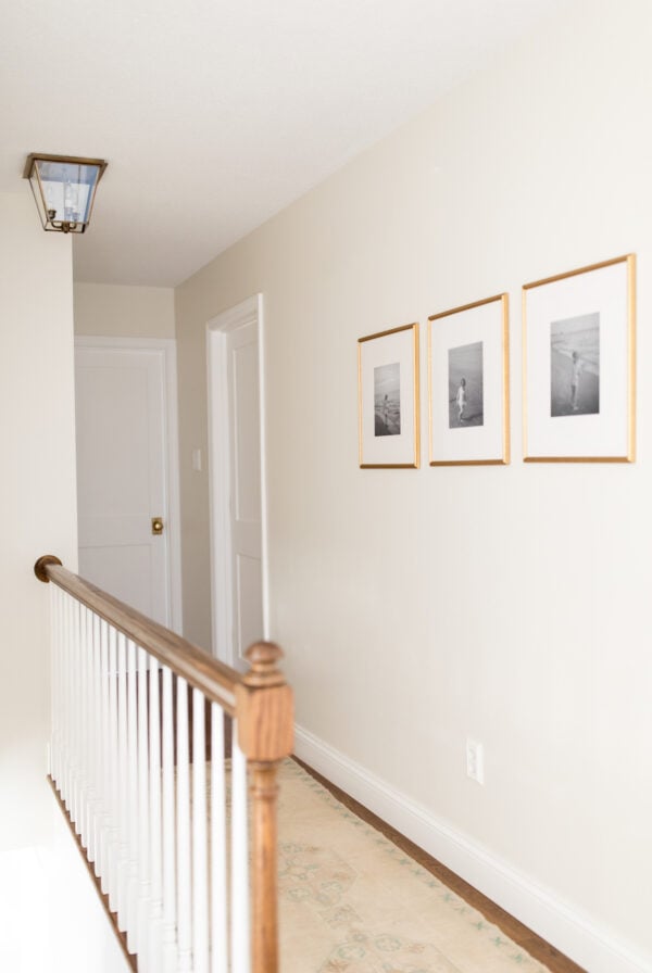
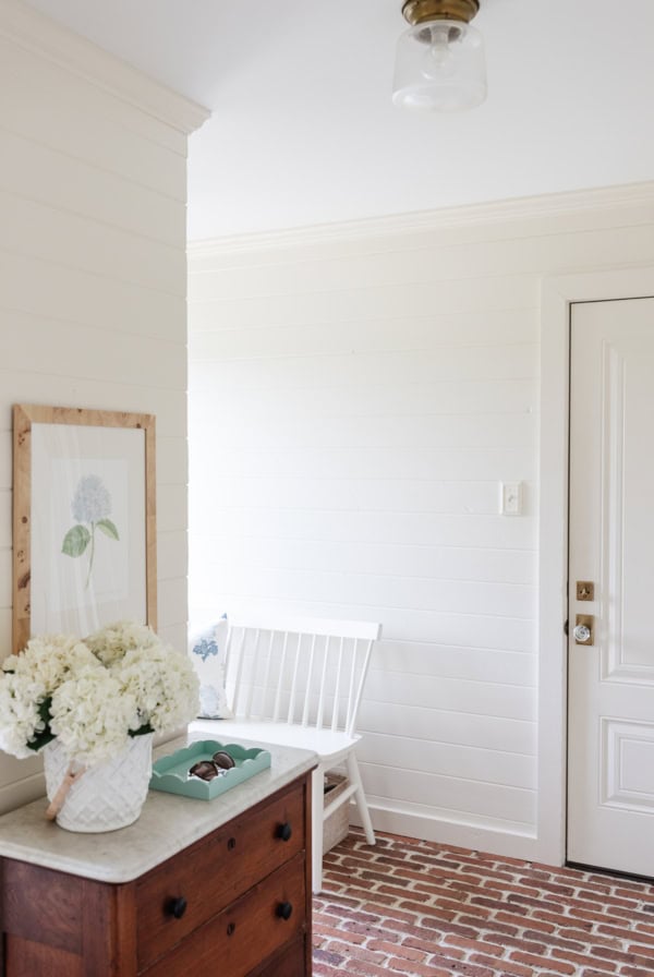
We loved it so much we painted the lake cottage entryway, hall, living room, kitchen, stairwell and lower living room with it as well. It’s a beautiful fit for our slightly more modern lake home.
Is it a fit for every space? No.
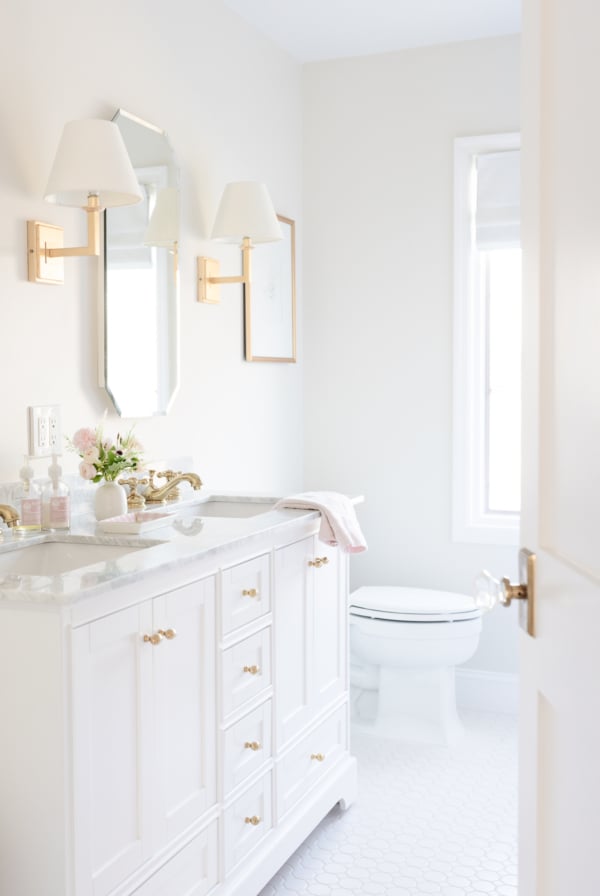
About Farrow & Ball White Tie
Fits Well In
- open concept spaces
- rooms with a lot of natural lighting
Makes a Room Feel
- light and airy
- soft
- slightly warm
Undertones
- yellow
Styles it Fits
- traditional
- transitional
- country
I first considered this color after seeing it in my friend Ina Garten’s home. I loved how warm, yet airy it made the bedroom and office appear. (And yes, I’m dreaming, I don’t know Ina).
It also appears to be a close fit to what Serena and Lily used in catalogs in 2019.
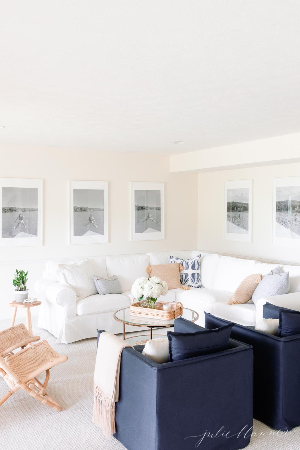
Farrow and Ball White Tie in Various Lighting
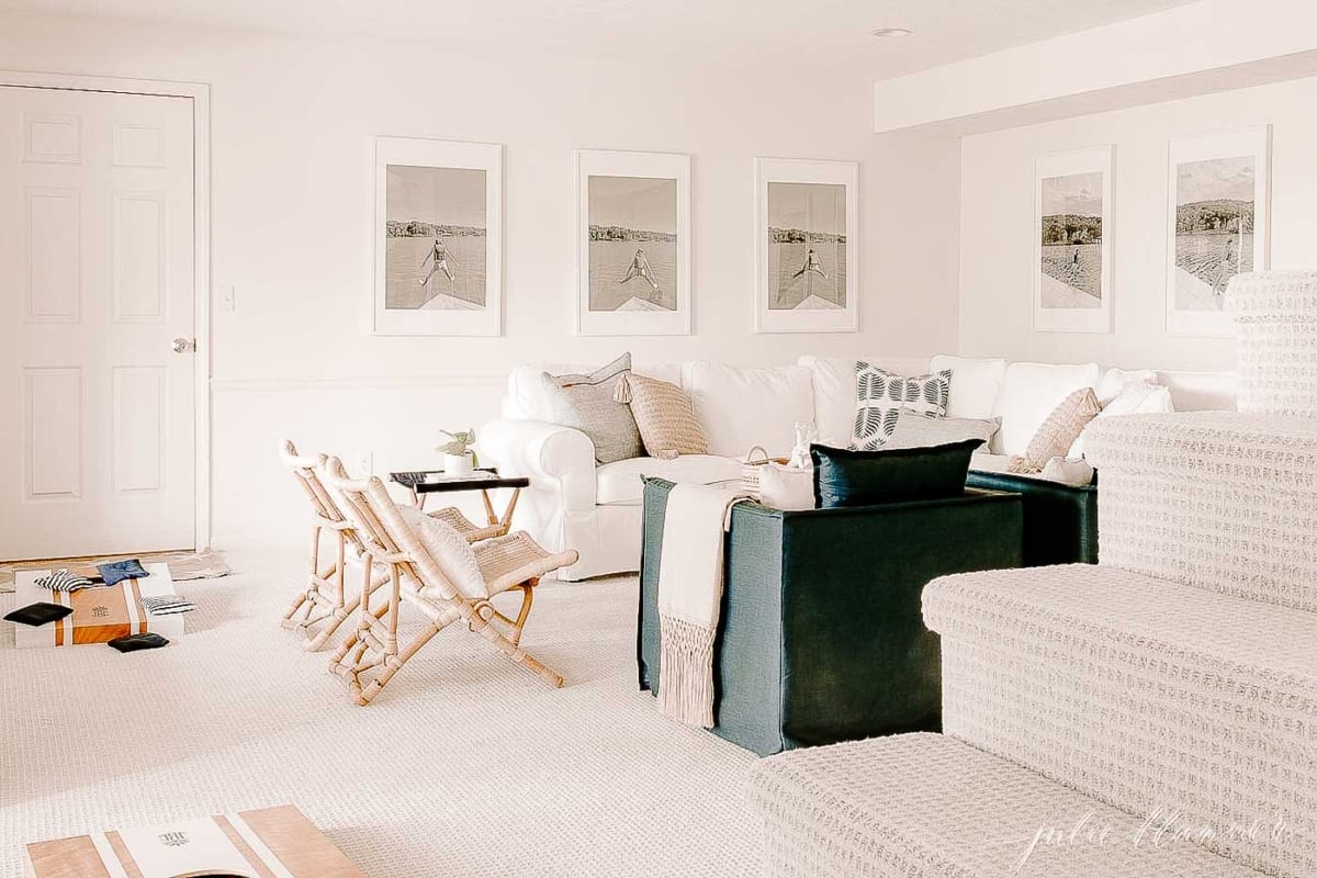
One of the things I love about this color is how different it appears at various times of day, and in different types of lighting. Below, you’ll see an example of morning vs evening light in our basement living room.
You can find all of our paint colors here and keep track of all of yours here. If you use any of them, please return to share your thoughts!


I have a kitchen with F&B white tie cabinets, however it doesn’t get a lot of natural light so it does go more yellowey. We are just about to paint and I am looking for neutral that will keep the space as light as possible. Any suggestions on what white might go beutifully with white tie? Thank in advance for your help.
Hi Annette!
Unfortunately, we don’t offer paint consultations at this time. I would look at Simply White, it’s a great option with just the slightest hint of cream undertones.
Have a beautiful week,
Julie
Hi Julie, I am planning to use White tie on my walls in a beach house with lots of light. What would you recommend as a trim and doors color? Same? or another tone like Matchstick? In the corridor however there is not a lot of light, and we have like 6 doors…… Thank you for your help!
Hi Petra! I recommend using the same color or Farrow and Ball Pointing. Another beautiful option is to mix White Tie and Pointing and do the walls in satin and the trim in semi-gloss.
Would you put F&B white tie in a basement with little natural light? Or do you recommend staying away from yellow tones?
I would not, I recommend Swiss Coffee, Simply White, Cloud White or Soft Chamois for a basement
All of your articles are so helpful! I cannot thank you enough. For mixing F&B white tie & pointing, is there a ratio for each that you recommend? Or a ratio you know that would give the right balance to play with other whites (West facing room with big window)? I’m interested in trying this for my daughter’s nursery! We are doing picture frame wainscoting behind her crib and will paint ceiling, trim, wall – everything one color. Very classic and European Elegance (as I call it) feel. I’m in love with so many colors, just need to see what doesn’t clash with other whites.
Would White Tie still work in a room that doesn’t receive a lot of natural light? If not, what other F&B cream paint colour would you recommend?