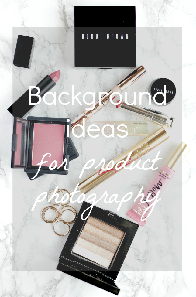
I’m so overwhelmed by the amount of love I’ve received from you guys over the last two days and I want to thank you all so much! I’m so glad that you’re loving these posts! As the “photography week” continues, today I will talk about few ways of creating beautiful backgrounds for your product shots.
Background ideas for product photography
Creating a nice, clean and interesting background can be challenging. Here are few ways to make it easier:
Cardboards
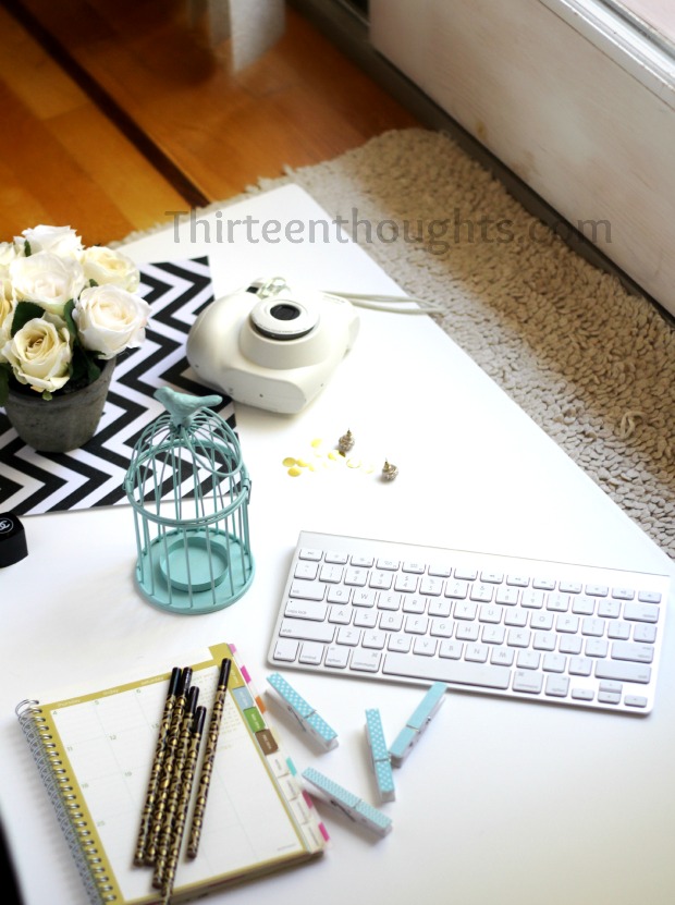
I have a whole bunch of cardboards that I bought at Michael’s Arts & Crafts store for only a few bucks and they have served me so well! I already showed you how I use my white one right here:
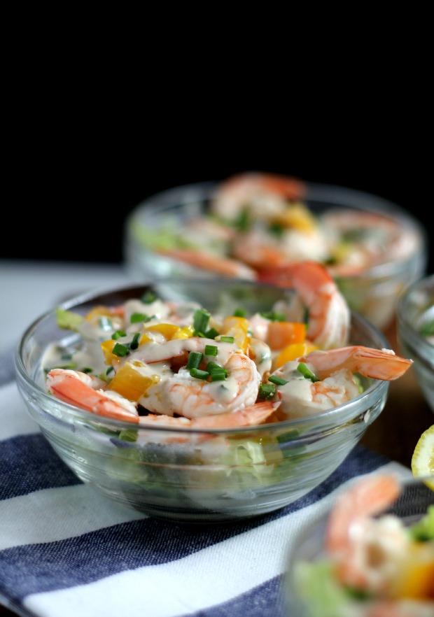
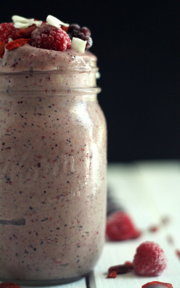
My other favorite has got to be this black one that I often use to photograph my recipes. I honestly feel that it took my food photography to a whole different level. This is how I use it:
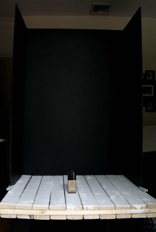
So sorry for the crappy picture but it’s been raining here for the last couple of hours and I couldn’t get a good shot, but still wanted to show you what it looks like “behind the scenes”.
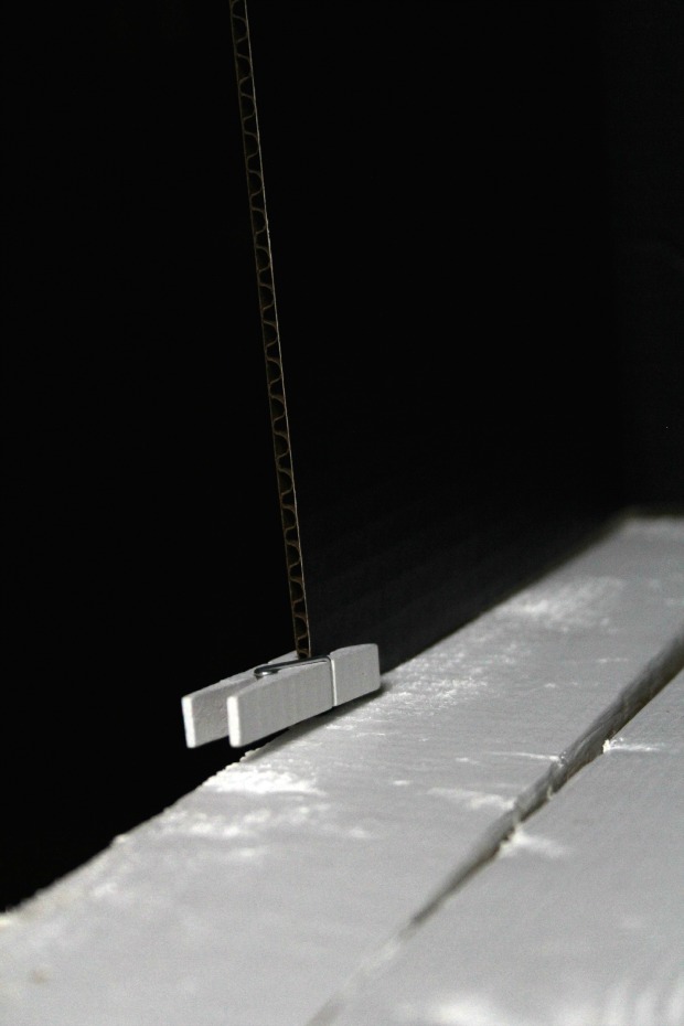
I use these tiny clips to keep the board in place. Can’t tell you how many times it fell over on the food I was photographing :).
End result:
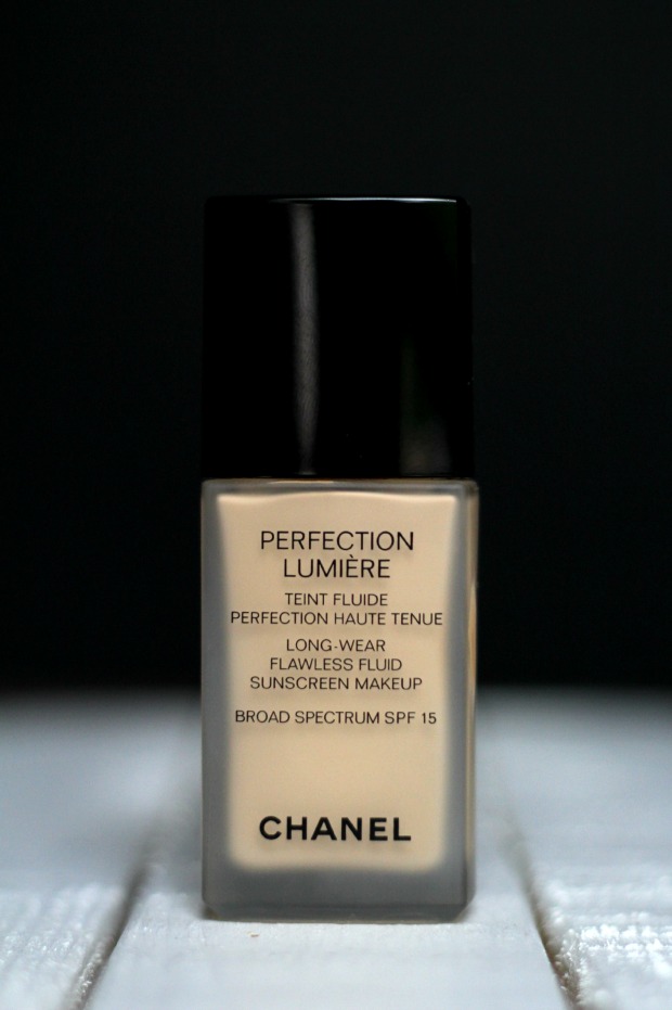
I place my food (or product) on a small wood palette that my husband helped me make and I put this huge piece of black cardboard behind my subject. When my lens focuses on the presented food, the background is softened and loses a bit of focus, which makes it look like I’m taking my photos against a black wall. Cool thing about this is that I can use any color that I want, making it different and interesting each time. For some reason, I really like black; I think that it creates a nice contrast between the food and the background.
Computer wallpaper
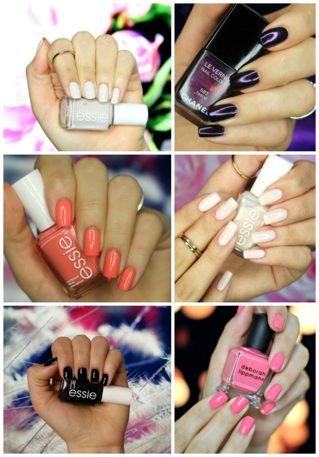
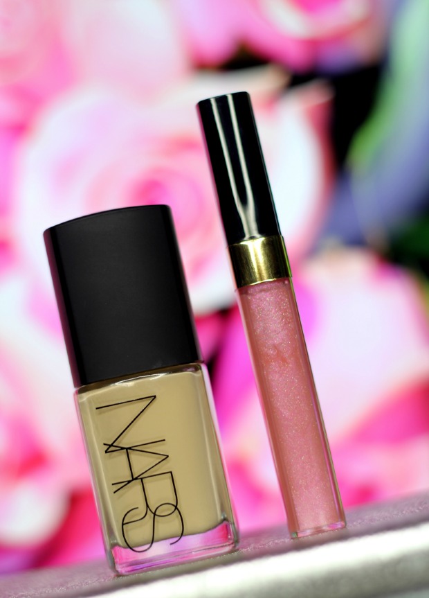
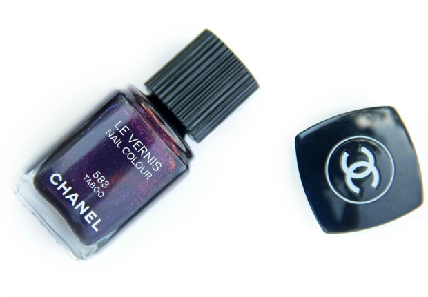
This is yet another easy and essentially free way for creating unique setting. Just change your wallpaper on your computer to anything that you want, place it behind your products (stacking them up on books or something else that you find handy) and take your pictures. I love using this technique for my nail swatches. I can literally pick anything I want for my background. For instance, when I was taking pictures of the “Taboo” polish by Chanel, I used galaxy wallpaper.
Few of my nail swatches using my desktop wallpaper:
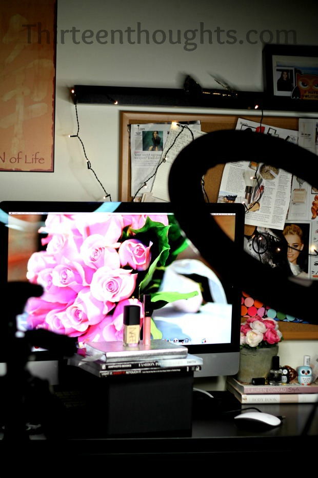
This is my set up when taking pictures using a desktop wallpaper (you could do the same thing with a laptop). I place my products in front of the monitor, I have my tripod and my ring light in front and I snap away. Again, I’d prefer natural light, but just see how dark my room is.
End result:
Placemats
I have tons of different placemats (not gonna lie, I’m a bit obsessed with them) and sometimes I use them for non-food photography as well. Here I was taking a picture of a hair product that came in white/pink packaging. At first I took it against white background and just “wasn’t feeling it”. I looked around the kitchen thinking of something to use and then I noticed my pink placemats. I leaned one against my laptop, placed my products in front of it, added some flowers in the back and it looked 10 times better.
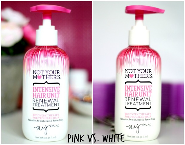
The day when these were taken was a very gloomy one and I really struggled with these photos. It was so difficult to get my background to look pure white or even close to white. I really don’t like the dull, sad gray color that I kept getting. I can’t tell you how many times I’d spend hours trying to get a nice picture only to find that once imported into my computer they all look like crap. At the beginning of my blogging adventure I didn’t let that bother me too much and I thought that as long as I have a picture to go with the post, I’m good. After a while that started to bother me a little bit and I decided to put more effort into it and go for quality over quantity. That was when my love for photography was born. I can spend hours taking pictures, but if I’m not completely satisfied with the finished product, I won’t publish them and try to do it all over again the next day. I realize that some may think “it’s just a blog, it’s just a picture, who cares?” The truth is, right now my blog is a huge part of my life. I never had a hobby, never had passion in my life. Once you find that thing that you love doing so much, you only want to do your best and this is exactly what I’m trying to do.
White backdrop
Last year I came across Rae’s blog when searching for inspiration for photography. She had this cool tutorial for an “infinity effect” backdrop. To create one all you need is a stapler, a fairly large box and a piece of white paper. This set up is great for product photography; it creates crease-less, uniform background and looks clean and bright. I do have to mention, however, that this works the best with natural light.
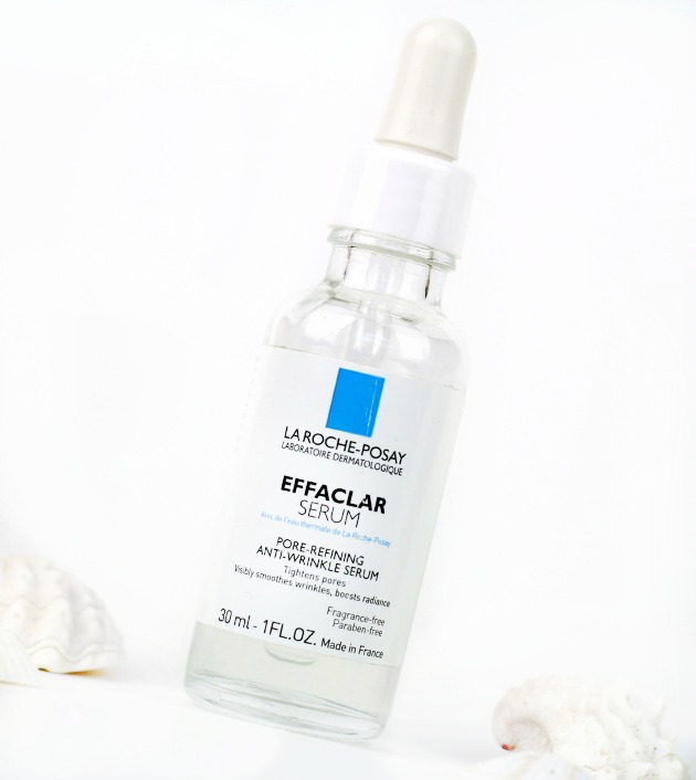
This was taken using my white “backdrop” box.
This was taken using the same method, but I also edited it in Photoshop Elements using the “dodge” tool to create that flawless, white background.
Also, make sure to check out my tutorial for a white/grey marble photography background right here.
This is it for backgrounds. If you guys have any other ideas please share them with me! Once again thank you so, so much for all the kind comments, it’s still a bit surreal but my first photography post is already my most viewed post ever, and it’s only been up for two days! How crazy is that? You guys inspired me so much that I decided to make “Photography” a permanent category on the blog. That way, as I learn more and more about photography, I can share it all with you.
For more updated Photography tips click here.
Don’t forget to follow me on Facebook, Twitter and Instagram to see what I’m up to on daily basis.

66 Comments
cecilvedemil
September 25, 2014 at 1:41 pmI think it’s a really good idea to use the computer and put some cute pictures as a background. I like to use magazines or clothes catalogs as backgrouds. Sometimes they have cool pictures that are simple and don’t distract you form the principal obkect of the picture. However, I don’t really take pictures for my blog that much, but i really have to get into it.
Thanks for sharing such useful tips :)
xx cecil // http://www.wednesday19th.blogspot.com
Paula
September 25, 2014 at 3:01 pmClothes catalogs is a great idea! I like using magazines as well :) Thanks for reading!
Neesha
September 25, 2014 at 1:49 pmOMG! This photo is freakin’ insanely amazing. I can’t wait to try out some new techniques. This really has inspired me. Thank you so much for posting
Paula
September 25, 2014 at 3:02 pmAw, thank you so much!
Kate
September 25, 2014 at 2:25 pmLoving this series of posts and saving them all for future reference! Thanks so much for sharing your fantastic ideas – you’re so creative and clever and the results are beautiful. x
Kate Louise Blogs
Paula
September 25, 2014 at 3:02 pmYay, so happy you’re enjoying these Kate! Thank you so much!
MD (@ByourBself)
September 25, 2014 at 2:41 pmMy main objective right now on the blog is to improve my photography. This post will be incredibly helpful to me! Those are great tips I would have never taught of!
MD | http://byourbself.blogspot.ca/
Paula
September 25, 2014 at 3:02 pmThanks so much for reading and good luck!! ;)
Jemma
September 25, 2014 at 3:35 pmWhat great ideas – I partial to go for a fluffy white cushion but these have given me so many more ideas!
BerryBloomXO
September 25, 2014 at 3:54 pmThe desktop background is pure genius! I remember thinking: WOW I love the way Paula has photographed the Deborah Lippman polish – the background looks stunning!
I am loving this photography week theme, Paula! Thank You so much! <3
xoxo,
BerryBloomXO.com | Beauty & Lifestyle Blog
Paula
September 30, 2014 at 7:52 am:D:D Aww thanks so much Puja!!! <3<3
Lauren Susannah
September 25, 2014 at 5:01 pmI’ve never thought if using the laptop as a background, that’s such a good idea! I always tend to use the same backgrounds but this post has been really helpful in giving me some inspiration! Thanks! :)
Paula
September 30, 2014 at 7:52 amThanks so much!
belikealady
September 25, 2014 at 7:49 pmI cant say how helpful is this post. tnx
xoxoxoxo
Paula
September 25, 2014 at 8:30 pmThank you! So happy to hear that ;)
Sophie Sierra
September 25, 2014 at 8:37 pmTrust me love you deserve all the love in the world, but I’ve told you that a million already right? :P Aaaah, this is such an ideal post Paula! Background ideas for photography is a topic I’ve never seen on a blog before, and this just proves photography is a perfect topic for an expert like you to cover!
I felt so excited and inspired reading this, all too often I rely on Graham’s shots (lazy, lazy). I used to mess around with my camera at home but I just don’t these days. I feel the house is always a mess and photo ops are limited. But your passion is so catching and I definitely want to try harder now :) Your white cardboard looks amazing, I love your white backgrounds best, they look so professional and fresh and really highlight whatever you’re capturing. I’m not even sure what I thought they were, I thought you had a magic Paula wall or something haha ;) And likewise, the black cardboard provides such a contrasted base for your recipes, and make-up posts! Wow!
Your computer desktop idea is something I never would have thought of! Such a cool, cool idea love ;) I’m in love with your last shot; the white background is just breathtaking and takes photography to a whole new level!
Massive, massive congrats on your most viewed post earlier this week my love, it is only what’s deserved and I think everyone agrees when I say what an inspiration you are to us all! My heart could burst with pride, really!
I hope you know that you always were amazing, and always will be, no matter what! Keep shining my little star! I love you! <3
Sophie xo
Paula
September 26, 2014 at 7:04 pmAww thanks so much Love!!! It makes me feel so happy that this post inspired you and sparked your excitement! I definitely sometimes feel like my house is a mess and that I don’t have too many fancy ops that I can use for my images. But that’s when I got a little creative and decided to work with what I’ve got. :) No magic walls in my house hahaha :D
Thank you so much, I still find it hard to believe that this many lovely people would want to visit my little blog. It really is a cool feeling :) And I hope that YOU know just how amazing YOU are :). Love you!!!!
Divya
September 26, 2014 at 5:44 amSuch great tips!
http://www.eatwearwander.com
Paula
September 26, 2014 at 7:05 pmThanks!
Vickie
September 26, 2014 at 7:04 amI’ve never thought of using computer desktop wallpaper as a photo background! That’s an ingenious idea! Thank you for such a great post, I’m definitely pinning this one for later.
Vickie
Paula
September 26, 2014 at 7:06 pmAw thank you so, so much! Unfortunately I can’t take credit for the idea with the desktop, but I do have to say that it’s brilliant :) .
sasa
September 26, 2014 at 11:15 amLove these photos<3
http://www.shallwesasa.com
Paula
September 26, 2014 at 7:06 pm<3
Lorietta
September 26, 2014 at 6:01 pmawesome tips!:) I use my bathtub as a white backdrop box! I know it sounds weird haha:D
http://www.Lorietta.cz
Paula
September 26, 2014 at 6:04 pmNot weird at all! I saw your photography post and know exactly what you mean, I think it’s brilliant! ;)
Lisa
September 27, 2014 at 5:25 amThis was amazing!
Thanks for the background ideas!
I love the black one :)
http://www.bubbly-color.blogspot.com
Paula
September 27, 2014 at 8:43 amThank you.
Steph Defined
September 28, 2014 at 1:41 amYour idea about using the computer background is brilliant! I am going to have to use that from now on in!
http://definedbysteph.blogspot.com/
Natasa
September 28, 2014 at 6:02 ami love this post. so many great ideas :))
Paula
September 30, 2014 at 7:51 am<3
Rae // theNotice
September 28, 2014 at 10:21 pmThanks for the link love, Paula! I love how many different “sets” you’ve outlined here — I’m actually trying to get better about varying my backgrounds right now, so I’ll have to give some of these a try!
(The computer monitor one is brilliant. Makes me wish my screen was a little bigger than a measly 13″! :P)
Paula
September 29, 2014 at 7:25 amYou’re welcome Rae, I love your blog! Thanks so much for visiting! ;)
Nereyda @Mostly YA Book Obsessed
September 29, 2014 at 7:56 pmExactly what I was looking for! Bookmarking this. What kind of lighting do you use?
Paula
September 30, 2014 at 7:51 amThanks so much! I usually prefer natural light like I said in the post. You can see my previous post where I listed and linked all of my equipment.
Gemma Oxford
September 30, 2014 at 6:52 pmI never even thought to use a desktop! So clever and customisable! xx
Paula
October 2, 2014 at 6:49 pmCan’t take credit for that idea, but I love it!!
Claudia
October 22, 2014 at 7:43 amGreat post! This is so handy, will definitely try some of these out, I just use pretty notebooks and magazines at the moment but I fancy a change.
Claudia xx | Beauty and the Chic
Paula
March 4, 2015 at 3:18 pmThanks Claudia!
Dee
December 30, 2014 at 10:29 pmSuch cool tips! I made a light box at. Home and usually take my photos there but am always looking for little ways to make the pics more interesting. Luv the computer wallpaper idea!
Paula
March 4, 2015 at 3:19 pmThanks Dee!
Bruna Marconi
January 14, 2015 at 1:20 pmThank you for the tips
I’m gonna do a backdrop box for me, love it
http://www.blogmafiadamoda.com
Paula
March 4, 2015 at 3:19 pmYay! ;)
Abi
March 21, 2015 at 12:51 pmThis post was so helpful! Simple yet inspiring, I can’t wait to improve my blog photos! Thank you so much for the tips :) xx
Paula
March 22, 2015 at 9:27 amThanks so much Abi! So happy you liked it! ;)
Kay's Ways (@OdashKay)
March 29, 2015 at 12:56 pmI’ve done the white paper trick many times but after reading this I feel like my life has been given to me. The desktop background is such a great tip!!! I can’t wait to utilize that one!!
Thanks for sharing!
Paula
March 29, 2015 at 1:32 pmThank you, I’m glad this helped! :)
Emily Scholes
June 23, 2015 at 12:44 pmWow this is such a helpful and brilliant post. I have just started blogging and this will help me so much. Thank you for sharing your tips!xo
Madison
July 5, 2015 at 3:52 pmAlready tried the computer screen background! Such a fantastic tip and worked so well! Will be bookmarking for future reference! Thanks so much
lovemadisonpaige.blogspot.com
Zovesta
July 15, 2015 at 4:05 amGreat post! Thanks. <3
Paula
July 24, 2015 at 4:52 pmYou’re welcome! :)
Mich Kalon
September 21, 2015 at 9:37 amGreat tips! I can’t wait to give them a try.
Nina H.
October 3, 2015 at 10:57 amGreat! Please visit me :) https://twitter.com/CY_Blogger
Daria Shualy
February 15, 2016 at 5:56 amReally useful tips! Sharing on Pinterest. Thank you!!!
Elisabeth Wallace
February 18, 2016 at 10:43 pmSo helpful! Thank you very much for your tips and tricks. I love posts that go “behind the scenes.” Can’t wait to utilize some of these!
@the.abstract.life
Cherish.
March 30, 2016 at 9:17 amHoly cow! I never thought of the computer background idea. Thank you!!
Ella Catherine
June 20, 2016 at 9:13 amThis is so helpful thank you! I really want to make my photos far more interesting than just a white background :) xx
Jordan
September 5, 2016 at 2:31 amThe background requirements for product photography varies according to the product I guess. If its food photography then a non-plain background can work. But I feel like background for real products need to be solid/plain color. Even in most of the e-commerce sites they prefer to show the product shots in white background. So taking shots in white background or to remove the existing background in Photoshop may work in this case.
Mary.D Hamdan
December 7, 2016 at 7:30 amMuch Appreciate! Very Helpful Article.
Md Abul Kalam Azad
February 13, 2017 at 10:19 amGreat article for product photographer. It is absolutely helpful for online marketing and selling product.
Justin Johnson
March 20, 2017 at 4:38 pmBest Background of product photos will make it Excellent for showing on website what will make customer attractive to the products buying.
Abigail Olivia
April 24, 2018 at 8:19 amSuch cool tips! I created a light-weight box at. Home and typically take my photos there however am forever yearning for very little ways that to create the pics additional attention-grabbing. Love the coumputer wallpaper idea!
Maria Hernandez
March 16, 2019 at 2:57 amThe background requirements for product photography varies according to the product I guess. If it is food photography then a non-plain background can work. But I feel like background for real products need to be solid/plain color. Even in most of the e-commerce sites they prefer to show the product shots in white background. So taking shots in white background or to remove the existing background in Photoshop may work in this case.
zubida
January 27, 2020 at 12:01 amNice post. Choosing the proper background for your product photos boils right down to a couple of things: your brand, your products and your audience. Your backgrounds should enhance and complement your brand, highlight your products, and fit your audience’s preferences.
Jayden Lewis
January 13, 2021 at 5:31 amThank you for your post. I have read through some similar topics! However, your article gave me a very special impression, unlike other articles. hope you will share more valuable ideas.
Elizabeth
December 12, 2021 at 4:43 pmJust found my new favorite blog-thanks thirteenthoughts!
Mark Williams
February 18, 2022 at 8:40 amFor product photography background ideas, this blog is one of the best. Photography is my passion. I am working dedicatedly in this industry. Thank you for your blog.